Comic Review: RAT GOD #1
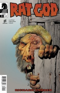
RAT GOD #1
Writer: Richard Corben
Artist: Richard Corben
Colorist: Richard Corben
Publisher: Dark Horse Comics
Price: $4
We’ve reviewed almost all of horror comics legend Richard Corben’s latest material and it has been received fantastically and not just because Richard Corben. His adaptations of classic Edgar Allan Poe stories struck precisely the right balance between adaptation and improvisation, lending the stories his own delicious brand of black humor but preserving their eerie strangeness. It also goes without saying that his artwork was like poisoned candy, delicious and horrible at the same time. His return sees him taking inspiration from Poe’s successor, HP Lovecraft, and while this is not the first time Corben has illustrated the work of Cthulhu’s creator, Rat God appears to be more a riff than a straight adaptation.
The first twist of Rat God is that, in true Lovecraftian fashion, it’s a narrative in flux, between time, introducing us to a pair of Native Americans on the run. But Corben also defies Lovecraft in the sense that these natives are actual characters, protagonists of a sort, rather victims or lifeless antagonists. He delicately laces their plight with touches of supernatural menace, preferring to build suspense and intrigue. When the chronological slide occurs, there’s a nice touch of Corben’s kooky humor streaked through the weirdness and the tale switches to a more stereotypically Lovecraftian yarn, albeit wisely acknowledging and inverting the racism present in some of HP Lovecraft’s work. It’s tangled up in the timeline funkiness, with our new main character’s story seemingly abutting the rebooted lives of the previous protagonists somehow. He’s clearly in the process of building a mystery but thankfully that’s thrillingly interrupted by a ferocious assault, leaving us on a cliffhanger. It’s dense but it’s also packed with enough action that Corben’s introduction to Rat God reels in properly.
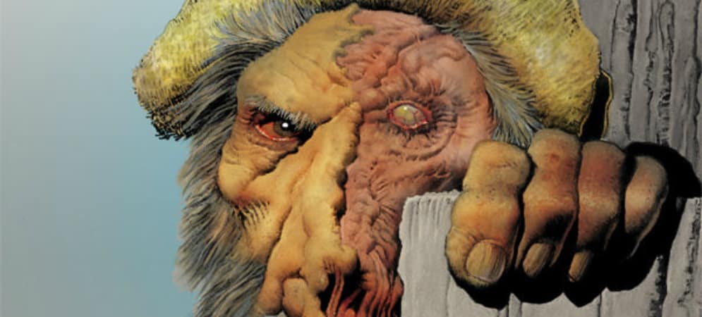
His art ain’t too shabby either. It still amazes me that Richard Corben is 70+ years old, because his lines aren’t just detailed but more dynamic than half the modern artists I see. He’s comfortable drawing untamed wilderness, blanketed tundras, rustic backwoods and collegiate interiors. His characters still have that distinctive caricature look he’s known for but there’s considerably more flexing of his anatomical skills in this book than there was in his Edgar Allan Poe adaptations. I’d like to personally thank Mr. Corben for drawing a delicious, unvarnished male in glorious nudity in addition to plenty of naked woman. He’s probably aware many will be titillated by this but he’s obviously pursuing art as well, not just being sleazy, and that’s fantastic. His coloring is perfect. Blood is the perfectly inaccurate shade of piercing crimson. When we’re in deep woods, it’s a moody green, flush with darkness but not impenetrable. An older native has an incredible skin tone, one that must’ve taken a while to perfect. His layouts are punchy and dense but not too busy and he subtly divides flashbacks with curved borders as well. His lettering is wild, crunchy, colorful and exuberant.
Compared to the other Lovecraftian title debuting this week, Rat God not only manages to be just as interesting in terms of riffing on Lovecraft but matches it for artistic quality. There’s more experimentation going on in Nameless but the unified lines, colors and lettering of Rat God give it a weightier visual presence, justifying the premium price tag. Neither of these titles is better but they have their own appeals and Rat God may turn away readers unfamiliar with old school pulp horror. Those readers will be missing out on a damn good horror comic that’s only just getting warmed up. Come for the atmosphere, stay for the suspense.


