[COMIC EXECUTION] 8/15 – ‘GHOSTED’, ‘RED SONJA’, ‘IT CAME!’
IT BEGINS: THE NUMBER TWO-ING!!! That’s right, I’m finally reviewing some of the second books of previous titles whose debuts I had the pleasure (or ambivalence) of analyzing. The idea of the column is actually that each of these series is balancing precariously on the precipice of a cliff with a noose around their neck. Should they slip up, it’s a short fall and a hard snap as I put them to bed for failing to pass muster in a crowded market. Call me a sadist but hey, what did you expect from a site called DESTROY THE BRAIN? Without further ado, MY VICTIMS FOR THIS WEEK:
 GHOSTED #2
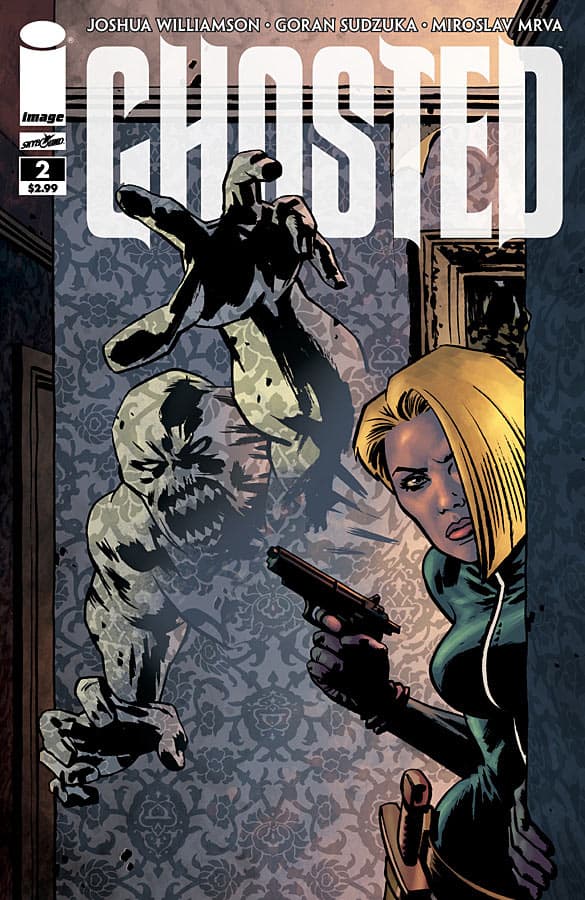
Writer: Joshua Williamson Artist: Goran Sudzuka Colorist: Miroslav Mrva Publisher: Image Comics Price: $3 So this book has done some strange things to my enjoyment of comics. By all rights, I should have executed this comic for the same reason I was dissatisfied with the first issue; the story literally goes nowhere. Now, I’m sure most readers who are much less cynical than me are content with the meagre plot progression and flickers of character development that we’re treated to in issue two but what it comes off to me as is this: we’ve got this neat little story that would probably make a better short story than a comic book miniseries but instead we get an unnecessarily bloated narrative that pretty much serves only to sell pages of art. That sounds harsh, but come at me with some kind of explanation why what happens in this issue is actually necessary. It’s absolutely not. First, we get a startlingly short tease of just what kind of atrocities were enacted within the haunted mansion that the protagonists are casing for the purpose of stealing a ghost from it. It’s a cute way to hook anyone who hadn’t already gotten on board with the first issue but it also unfairly stacks the deck against the rest of the book; what kind of horrific things happen that could possibly hold a candle to what’s hinted at from the start? And I can’t help getting the feeling we’re not even supposed to take these stories-within-a-story seriously; they’re told with all the jauntiness of a campfire tale. And if you look close, you can see that the characters in the flashback bear a passing resemblance to the very protagonists who are hearing the stories being told to them: the con man Trick has a startling similarity to the apparently cannibalistic Aldus Trask. The whole bit has a sense of the ludicrous. It’s followed by an equally cheesy montage of each protagonist within the mansion, going through their assigned tasks while their de facto leader, on the previous panel, writes (rather ominously) into what appears to be a journal of their ghost-stealing exploits. This is where I was ACTUALLY hooked. Why did they dedicate an entire page to Jackson’s scribbling? Why is his face engulfed in shadow as he does so? Why are we specifically shown a paragraph of his seemingly innocuous writing? If it was so meaningless, why bother? And it’s not just a fluke; a page later, we once again see a strikingly-malevolent close-up of Jackson writing into his journal as he outlines the roles of his crew. Something’s not right with Jackson and the way it’s foreshadow here is genuinely unnerving. This is followed up by the thief/Aldus Trask look-alike pocketing a statuette. Of course, this will be seen as a simple matter of reinforcing the character’s behaviors but it immediately struck me as off. The knick-knack he pinches looks utterly worthless. Literally, it could not be portrayed as more worthless, resembling nothing more than a terribly worn bust of some kind, an ugly one that gives off some nasty vibes as it is tucked into his jacket. It isn’t clear that there’s anything more desirable to steal in the immediate area but this character doesn’t seem to be the kind of amateur who’d fill his pockets with valueless trinkets right away. There’s something significant about what he took and I know it has something to do with what he sees in a hidden room deep in the castle. **SPOILERS AHOY** These two pages literally MAKE this issue. We get a beautiful full page illustration of a genuinely bone-chilling landscape full of jutting crags, swooping wraiths and crashing lightning. But that, as cool as it is, isn’t what got me. It’s the second panel on the next page: Trick, briefly struck frozen by what he sees, shakes his head in dismissal of it. Except there’s this “ghostly” overlay of his horrified face lingering in the panel, barely visible but impossible not to see when you notice it. It’s really quite deliciously frightening, even if I’m still not sure what it means; is it him seeing his own reaction and negating it? Or is it a sign of something more damning? And THEN, they follow that with a heavily contrasted view of the apparently empty room he’s been standing in the whole time, though it IS occupied by a lone chair? **SPOILERS END** Aside from a corny “moving painting” scene, nothing really happens inside the mansion from that point on. Some cops show up, putting a damper on the investigations and we’re reminded in a hollow bit of false suspense that being in the mansion at night is suicide. It’s not until the final panel that we get another thrill that I won’t give away but I will say is gratuitous in all the wrong ways, not to mention fairly pointless. So, as plot goes, I’m quite a bit more satisfied than I was with the debut. The art has definitely stepped up and Sudzuka’s versatility starts to really shine here; we get a lot of great setpieces such as the four horizontal panels with the moving painting, mirrored by the ghost stalking as the sun goes down. There’s a lot of nice symmetry in this issue; it starts with bloody murder and ends with it as well. The colors have stepped up also, again mainly because of how much diversity this issue has: we see a lovely sunset, there’s that eerily white room, and the gory carnage of the first page. I still don’t like how washed out everything looks but it now serves to better punctuates the moments of eeriness. Overall, I’m glad to say GHOSTED has me fully engaged. If anything, I have to commend Image for being brave enough to launch a mini-series whose appeal is not immediate, at least for me. It’s a procedural story that relies heavily on intrigue and, fortunately, the writing is smart enough to subvert expectations around every corner. I still feel like they’re relying too much on “this is a horror movie comic” because that doesn’t work in comics, folks. Take that cover, for example: there is NOTHING cool about that cover. Unless it’s supposed to represent that the woman is the REAL monster, in which case I’m just embarrassed for everyone involved.
RED SONJA #2
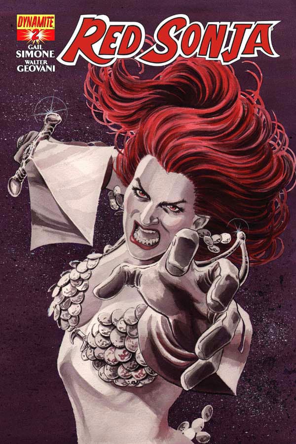
Writer: Gail Simone Artist: Walter Geovani Colorist: Adriano Lucas Publisher: Dynamite Comics Price: $4 I still can’t believe I’m paying $4 for this comic. But before I begin that rant (which is probably the only real problem with this book) I should at least go through the motions of talking about the actual creative product on display here. The story, continued quite punctually from the events of the last issue, sees the titular barbarian facing down her “sister” in combat as the withered kingdom she seeks to defend is descended upon by a massive conquering horde. Her sister, Annisia, appears at first to be fighting on the side of the invaders until it’s revealed (nothing particularly surprising) that she only wants to defeat Red Sonja. When we do discovery precisely WHY she seeks a fight to the death, it’s actually quite a neat revelation that I commend Simone for executing superbly, both in the reveal and the visualization. There’s a bit of silliness just prior during a flashback involving a frog-tongued captor who tormented them both. Amidst all this is an awesomely intense fight between them that leads to that big twist I mentioned earlier and the pacing is superb. THEN, a BIG thing happens! AND “We now interrupt your regularly scheduled comic for this two page advertisement of something you don’t care about, right the the worst possible moment. You love it. No, really, we know you do. We did focus groups and they all love having their thrilling suspense perfectly punctuated by irritating, impossible to ignore adverts. So, here you go. Read it. Did you read it? Good. Now, back to your regularly scheduled comic.” Really, Dynamite? ARE YOU JUST EVIL? I wouldn’t even have minded if the ad was half-assedly inserted somewhere before or after this, at a point irrelevant to the plot. But no; they specifically chose a page-turning moment to break any sense of momentum the story had for their cynical grab at our attention. That is NOT going to do anything but earn disdain from anyone with half a brain. Beyond that, there’s another nasty plot twist that I didn’t see coming and Red Sonja gets an ultimatum that wisely sets up her further story. It’s all clockwork but quite satisfying in the sense that nothing good will happen to Red yet it all clicks. Gail Simone is, as I’ve said before, a lovely writer. And the art is just as thrilling, maintaining the fiercely energetic and detailed standard set in the first issue while throwing a lot of really cool panel explorations at the reader without distracting too much. Of particular note is the massive battle scene supplemented by sharp little corner panels zooming in on the action, giving the conflict a powerful scale. There’s a wonderful close-up on Annisia’s enraged visage that is really gripping and it’s mirrored by Red Sonja’s crestfallen look a few pages after. So visually, RED SONJA #2 is worth the price of admission. But we shouldn’t be paying $4 for this book. It’s only 22 pages of comic and it’s interrupted very harshly by ads and weighed down by an additional ten pages of ads in the back. Not when books like GHOSTED are giving us only two pages less of comic at a dollar less WITHOUT disgusting ad interruptions. I mean, come on; this isn’t TV. We shouldn’t have to deal with this kind of cynicism. Here’s my suggestion: first, get rid of the ten pages of ads in the back. That alone should save you some printing costs. Then move your big two page ad to the back of the book. Then get a couple of extra pages of actual content. THAT would be a $4 comic. Not this heavy heap of blipverted crap.
 IT CAME! #1
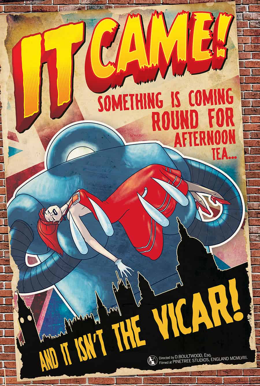
Writer: Dan Boultwood Artist: Dan Boultwood Colorist: Dan Boultwood Publisher: Titan Comics Price: $4 That tagline has got to be one of the best things I’ve ever seen. Fortunately, this book manages to live up to it quite thoroughly. This is from Titan Comics, a British publisher responsible for a previously reviewed book ‘Tomorrowland’ as well as the superb and highly recommended anthology simply titled ‘A1’. So, it’s a very British book. But not just any Britain; ’50s Britain as seen through the lens of campy, low-budget sci-fi movies of the era. The story’s very basic; an alien robot crashes in the middle of England and a not-so-gallant professor of astronomy crosses paths with it, bringing along Doris, who could either be a girlfriend, a lady friend, or some kind of assistant? It’s never made particularly clear what her role is and that’s kind of interesting in itself. The relationship between her and Dr Brett has a weird, condescending sort of familiarity that’s pretty much de rigueur for films of the era. It’s never quite subverted yet it’s pretty obvious the writer is satirizing the patronizing sexism of the times. A lot of the comedy comes from their respective stereotypes and there’s a lot of laughs, even as the story careens from one zany setpiece to another, dotted with punchlines all along the way. A small bit of the humor seems to be a bit cultural so I’m sure it’d be a significantly funnier book if I weren’t a dirty Yankee but it’s still packed with chuckles. The art is up to the task of both delivering wild thrills and sly punchlines with equal aplomb. Boultwood has a charming style that’s obviously influenced a bit by manga but stays solid throughout and despite the lack of colour, there’s quite a bit of depth to the visuals, with a lot of panels rich with details that never weigh down the action. Expressions are highly exaggerated and every character pops with fresh personality, though it does rely almost too much on caricature, despite the satirical tone. Yet there are so many laugh-out-loud parts, I can’t condemn the cartoonish approach. There’s even some really wonderful “advertisements” in the book that are all part of that playfulness at the expense of the era, so much so that you actually can easily overlook a pair of real ads breaking up some tense action. So yeah, like RED SONJA, there’s a set of ads cutting into valuable comic book time. Here’s the difference; there’s a solid 22 pages of comic here and two more pages of fake IMDB pages for the fictitious actor and actress who play the main characters, so if you count that, it’s 24. There’s literally only two ads for the whole book. As ad:comic pages ratios go, this is as high as it gets. And it’s the same damn price as RED SONJA. So, yeah, Dynamite is the only publisher in the industry who feels they can rip off their customers so badly. This book? Not a ripoff. Get it if you want a good laugh, get it if you’re into British comedy, get it if you like sci-fi satire. It’s good fun for the price.

