Comic Review: UNFOLLOW
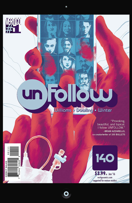
UNFOLLOW #1
Writer: Rob Williams
Artist: Mike Dowling
Colorist: Quinton Winter
Publisher: Vertigo/DC Comics
Price: $4
I am a social media person. My teenage years were devoutly chronicled on Livejournal, I released my own music on Myspace back in 2004, and when I discovered Twitter in late 2008, I was hooked in the worst way. I still operated a Facebook page, despite by aversion to the platform, and I explored every new iteration of social media; Tumblr, Google+, Pinterest, Ello and yes, even Yo. Yet I have a love/hate relationship with social media. Twitter manages to be both the most individualistic medium, yet also contains within it the largest mobs of any in this digital era. Facebook is literally the most misinformative structure I’ve encountered and Tumblr isn’t much better. So I don’t have any kind of emotional attachment, and like a sibling, some days there’s nothing I hate more.
Add to this the fact that it’s such a hot topic in fiction lately. I’ve reviewed two films that use social media networks as plot fulcrums, to poor effect; in both cases, the social networks felt paper thin and gimmicky. In the case of APP, though, it kind of made sense why this was the case, but Antisocial was annoyingly deceptive, ditching what worked in favor of tired cliche. In both cases, they were reaching for what the movie Unfriended succeeded in doing; using a social network as an actual vehicle for delivering fear, rather than an excuse for it. So when Vertigo started advertising a new comic called Unfollow, I was obviously wary. It’s a dirty job, folks, but someone’s got to do it.
Thankfully, the social network app in the comic (140) is not only wisely kept in the background but provides a key twist in the way the story is told; it unites a globally diverse set of characters, giving a feasible excuse to jump between locations like St Louis(!), NYC and Iran. And let’s talk for a second about how writer Rob Williams, a Brit writer who likely has never been here, treats St Louis, the setting where we’re essentially introduced to the novel plot and its de facto protagonist, David. David’s black, though light-skinned, and I was immediately wary of Williams trying to leverage our city’s racial strife to seem edgy but thankfully, he steers clear of doing anything besides making David a very human person, caught between his sister and a gang (led by a white guy) using her to steal from a cell phone store. I’m pretty sure David has to be some kind of aspiring guerilla filmmaker, what with his deep knowledge of cinema and generous followers on 140. Nobody I know who uses Twitter and is under 30 has more than 500 followers. But he gets the important details right; they use the train to get home, it’s absent white people, he’s wearing Beats knockoffs, etc. No harm, no foul.
As an introduction to the story, the first issue is intriguing, but mostly because of the opening and closing sequences (plus a moment of obfuscating surrealism in between), featuring a masked killer and a gun-nut who talks to [a] god. I didn’t much care for the way he writes his female protagonist though. If she’s supposed to be intensely unlikable, then he did a damn good job. Too good; if she’s not dead at the end of the next issue, I’m going to be hard pressed to pick up issue three. I also felt like his other female character, who is naked in front of a camera the first time we see here, is flat as well; she’s defined immediately by her trauma, something we typically see used as a shortcut to character development in comics too much. Again, unless she gets to be an actual person real quick real soon, I’d advise female readers (at least) steer clear; I was queasy about what seemed like pretty exploitative nudity.
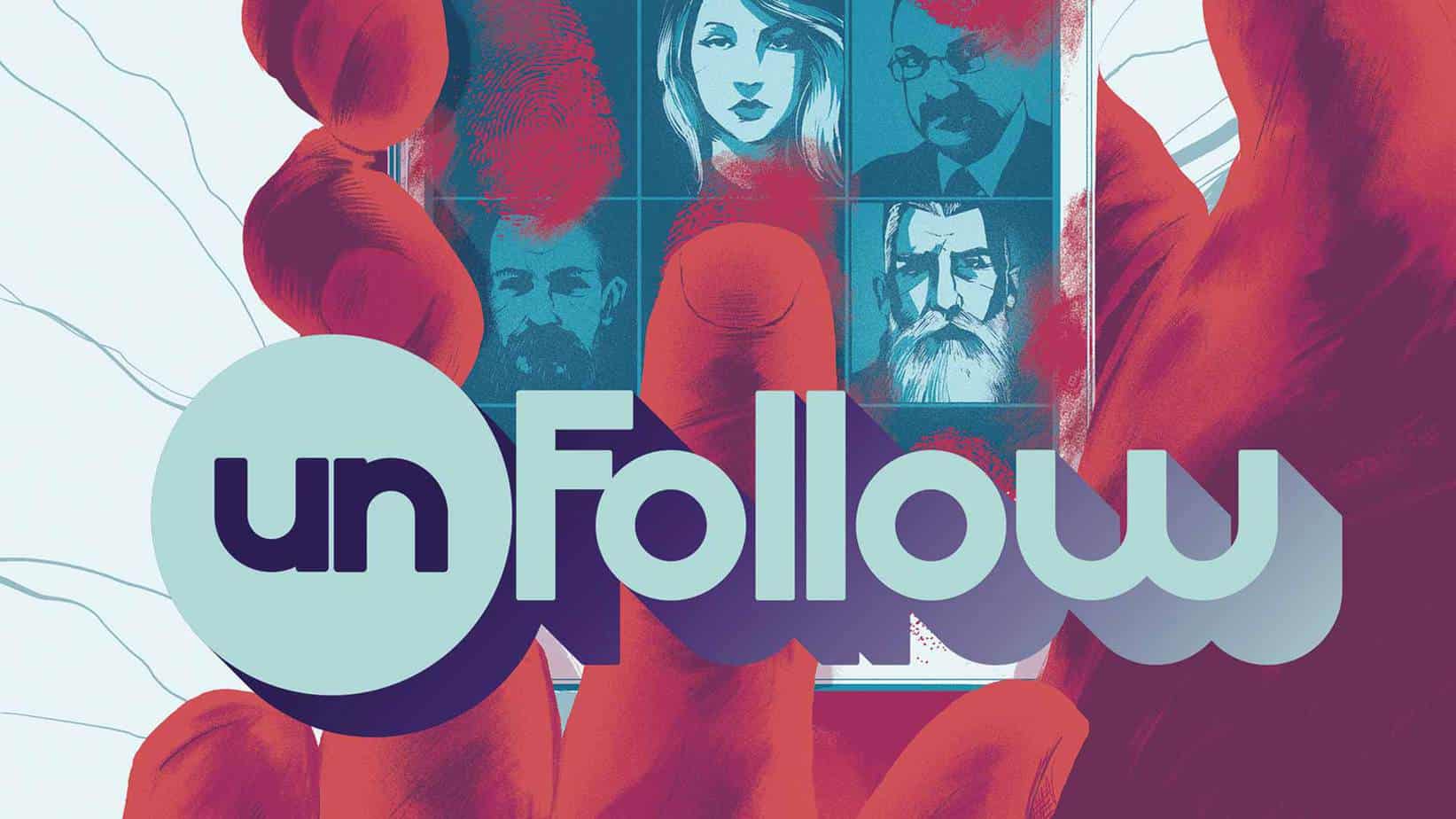
Artist Mike Dowling and Colorist Quinton Winter are tasked with creating a look for this comic that could not look more television ready. It’s realistic to a fault and the POVs too often forget that works great with a video camera is less than impressive in a comic; in a comic, a first person POV of someone hanging from a cliff just doesn’t have the same tension and, when things like this crop up several times throughout, it becomes too obvious to ignore. I hate to say it, but Unfollow is the perfect example of how some comic creators try too hard to appeal to audiences used to TV’s style of storytelling (or, more cynically, try to sell their books to TV). No surprise this is on Vertigo honestly, since they’re notably more guilty of this than most.
Unfollow skirts by on some heavy doses of weirdness and an intriguing story hook but falls short on character development. I’m blaming Vertigo for this; this issue could’ve been driven by David and the Iranian (or at least Persian speaking) woman but I feel like the editors pushed Williams to include more characters in the opening salvo. It’s too much too quick and despite an art team that is clearly on point, there’s not enough originality or visual lustre to keep me interested.


