[Comic Execution] 8/8 – ‘TRILLIUM’, ’SIDEKICK’, ‘BURN THE ORPHANAGE’
Gonna be a pretty intense week for comics; the big debuts this week are the highly-anticipated TRILLIUM and SIDEKICK, one from a critical darling comic writer/artist, the other from an established name whose recent comeback has been making headlines. But there’s several other hits that dropped alongside and, for once, I’m regretting limiting myself to only three titles. But I’d prefer not to strain my meager critic credence with too much BS so you only get to trudge through a few of these things. Also, I have to pay for these comics, so yeah: $$$.
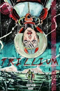 TRILLIUM #1
Writer: Jeff Lemire
Artist: Jeff Lemire
Colorist: Jose Villarrubia & Jeff Lemire
Publisher: Vertigo Comics
Price: $3
Jeff Lemire appears to be a part of a new breed to comic writers who entered their careers doubling as their own artist. Which seems, though I might be incorrect, to have given them a certain amount of boldness not seen in comic writers who’ve counted on artists to flesh out there ideas. Not to say that Lemire is so rebellious as to embrace the avant-garde but when he’s got the freedom to create new things, he doesn’t pull his punches. TRILLIUM is a perfect example of this.
It’s a sci-fi comic, which is interesting, because it doesn’t bother to engage in the often overdone world-building the genre is known for; we get aliens and some kind of alien disease wiping out humanity, but that’s it. All the other technology and futuristic detail is taken for granted, fleshed out a bit in a visual setting very reminiscent of ‘A Space odyssey” but with a touch more color. Which really is a good thing here, because the story immediately takes main stage, simultaneously following the journey of two adventurers who end up occupying a shared space, despite living what appears to be numerous centuries apart. So, it’s a time travel story? But that’s not even really the focus of each narrative; for our tale of the future, Lemire weaves a bleak portrait of a condemned human race whose sole hope lies in a rare plant kept secret within an alien colony whose secrets the protagonist is trying to unravel, but alas, the impending epidemic triggers the threat of a military invasion that she hopes to prevent by making one last diplomatic visit with the natives. Far into the past, a war veteran whose horrific experience in battle has him on a morbid quest for the secret to immortality and, ultimately, a legendary temple in the heart of the Amazon. In this issue, there’s a parallel theme of native exploitation; the future humans justifying their planned invasion of the aliens with a “us or them” mentality, while the post-WWII antics include violent incursions into native territory and some casual racism.
It’s all pretty dark, weird stuff but there’s quite a bit of interesting esoterica; the legend of immortality revolves around an Incan goddess whose body became the first flora, while the planet where a cure is being sought has a black hole close enough to be “visible” from the surface, underlining the idea of humanity forced into the outer reaches of space. These aren’t the only minutia that Lemire sprinkles his worlds with and that’s one of the many reasons why he deserves praise; to be able to tell a story this gripping but still lace it with clever background elements is hugely impressive. I wouldn’t pretend this is all original; in fact, it reminds me quite strongly of Darren Aronofsky’s ‘The Fountain’ in a surprising number of ways, though this story is told with far more strength and consistency. It really helps that the book’s format: the stories are told separately, starting on the front and “back” pages respectively, then meeting, in one of the coolest novelties I’ve ever witness in a comic, in the middle of the book. It’s actually a breathtaking moment and makes this book easily worth the price for anyone who wants to see just how innovative a medium comic books can be.
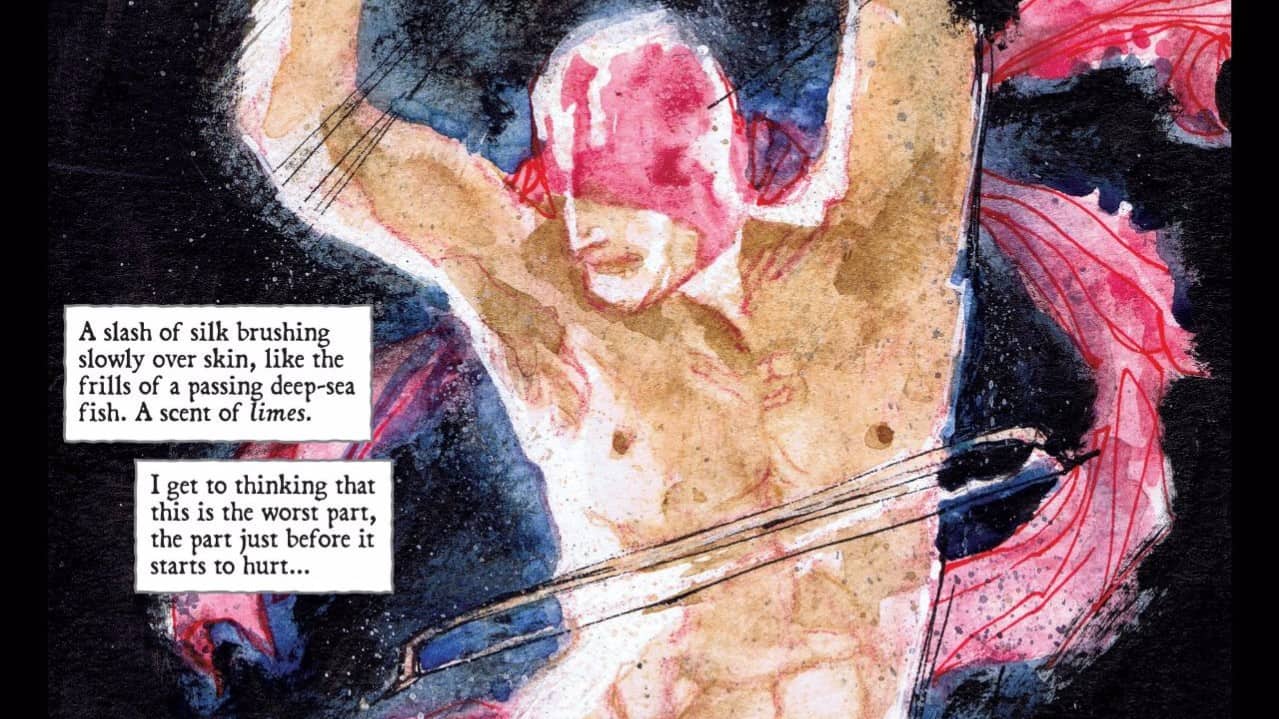
There’s the very small matter of Lemire’s art. It’s not bad art, really. He’s got a firm visual imagination that anchors each panel, developing detail without bloating. And his characters are rendered with generous emotion, the appropriately visceral reactions punctuating certain scenes. And the colors are to be strongly commended; there’s a very bloody scene that utilizes red watercolors amid browns and gray in powerful contrast and the wide-open panel of a character crossing a barren planet is imbued with poignant yet muted shades. But there’s still the simple fact that Lemire lacks the consistently clean, refined, solid lines of a pro artist. And unlike the very paranoid, scattered, weird ‘Mind MGMT’ that Matt Kindt’s style is so well suited to, TRILLIUM feels like the kind of story that would be improved greatly by a talented artist.
Yet, even as I point this out, I’m absolutely pardoning this 100% because TRILLIUM is just an incredible work that doesn’t deserve to be slighted by what isn’t a bad choice but more a limitation; I don’t know that any artist could’ve handled the story as bravely as Lemire does. Anyone who passes on this book specifically because of the art is contributing to an industry where fresh ideas and creativity are subordinate to technique. TRILLIUM is an ideal of what comic books COULD be. It’s also certainly one of the best sci-fi ANYTHINGS I’ve experienced in a long time. Read it now.
SIDEKICK #1 (Of 6)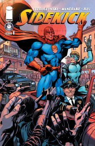
Writer: J. Michael Straczynski
Artist: Tom Mandrake
Colorist: HiFi
Publisher: IMAGE Comics/Joe’s Comics
Price: $3
As you can imagine with a title like SIDEKICK, this book is a post-modern deconstruction of a once-familiar superhero trope: the sidekick. With a tagline like “WITNESS A MODERN HERO’S FALL FROM GRACE,” you can reasonably expect a very dark, twisted take on the genre. And, sadly, that’s about all you get. So much of SIDEKICK is unbearably predictable; bright-eyed sidekick takes the assassination of his partner way too hard, spiraling into debauchery and shame as the real story unfolds behind the scenes. Even the “twist” is completely telegraphed:
*SPOILERS AHEAD*
His partner faked his death! Of course he did. The whole scenario looks like it was ripped off of Kennedy’s murder, down to the open-top convertible and head-mess spray. But it doesn’t feel at all like some kind of parallel symbolism, just laziness; there’s a panel of crosshairs resting on the target but it’s clearly just a regular panel with the crosshairs slapped on, not even bothering to actually make the reader feel like they’re looking through an actual scope.
I can’t help but see nothing but terrible when I look back at this book. There’s a scene involving a prostitute where the titular sidekick pretends to be charging her with prostitution but, get this, he’s actually a customer! Except… what? Nothing about her dialogue indicates that she’s impressed by his heroic identity so why would he do this in costume and risk being seen in such a situation, given how worried he seems about it? I get that his world’s supposed to be a gritty, nasty one where sex workers are borderline hostile to their customers but somehow her viciousness doesn’t strike me as necessarily being an attempt at realism. There’s a “wink wink” scene of said protagonist at a convention clearly meant to parody SDCC right down the name of the city, except it functions as an career fair for real superheroes. It’s cute but turns into an opportunity to put down the character yet again but what I don’t get is; if this sidekick and his partner were so famous, why is he being cruelly mocked by other heroes?
By the time “Flyboy” is shown watching an ex having sex from outside her window (seriously, who has sex right in front of an open window WITH THE BLINDS PULLED UP in what is clearly a heavily populated part of the city?) I was just done. I get it, the guy’s a serious mess in a world that’s a serious mess. Just, could you have maybe put some thought into the whole effort? It’s not even that there’s nothing good here; Flyboy has a “Kickstarter” type page that he’s trying to use to fund his crimefighting and it’s failing. That’s done quite cleverly, not too heavy handed but just right. And a drunken Flyboy apparently likes to get sky high in the nude, another cute little character quirk that, surprisingly, sells just right. And, near the end of the issue, he pulls a pretty awful stunt by basically faking a jewel theft so he can pretend save-the-day, except nobody’s fooled.
So it’s not that the whole thing is so irrevocably bad, it’s just barely good enough to be disappointing. As far as the art goes, I can’t say the title isn’t consistent. It’s good art, just not interesting at all. It’s superhero art, with no real creative effort involved. Mandrake is commendable for his emotional portraits, throwing out some quality sullenness and cheesy grins when needed. And there’s touches of atmosphere, again, where needed. But there’s really only one stand-out scene and it’s the pinnacle of the book, when Flyboy’s partner is “killed”. So, mediocre art.
It’s a mediocre book whose post-modern superhero concept is done better in titles like ‘The Standard’ or ‘Absolution’. What’s really amusing is how “Joe’s Counter,” a missive from the writer to his fans, basically states that the whole comic is his way of getting revenge on the sidekicks he loathed as a kid. I don’t know if he’s joking or serious but it’s definitely weird that he’d still be obsessed with a comic book trope that hasn’t been a “thing” in several decades. Whatever. I’m not recommending your book to anyone but the weirdos that are still reading KICKASS or, really, any of Mark Millar’s remaining fans. Otherwise, don’t waste your money.
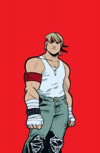 BURN THE ORPHANAGE: BORN TO LOSE #1
Writer: Daniel Freedman & Sina Grace
Artist: Sina Grace
Colorist: John Rauch
Publisher: Image Comics
Price: $4
Still not entirely sure what to make of this comic but in this case, it’s meant to be the best kind of compliment. For the record, I LOVE the cover for BURN THE ORPHANAGE. If it wasn’t a title I’d heard about, I would’ve picked it up for that alone. What’s inside is both oddly unexpected yet well synchronized with that visual representation.
BURN THE ORPHANAGE is a great big homage to early beat-em up arcade games like Final Fight and Streets of Rage, but there’s more going on here. The backstory involves the main protagonist investigating the arson of his childhood orphanage, leading him (as with the games themselves) through the ranks of a criminal empire and into the arms of the guilty party. But as his crusade progresses, we get to see flashbacks of him meeting his loyal friend Bear for the first time and it’s strongly implied in a tactful way that Bear is gay, even later on in the comic. He’s a wonderful character who provides a wonderful contrast to the surly goofiness of the hero. Then we meet his other sidekick, a badass dame with a bat and a hot bod who can dish it out with the big boys. Even as they’re pummeling something as horribly cliche as stripper ninjas, the way it’s all handled gracefully speaks volumes of how much love the writers have for their world.
The art is really fun as well, thankfully. There’s a lot of action and while some of it is page-filler, many panels sizzle with energy, all the nuances of character emotions as big as the story itself. At one point, the perspective shifts to a side-scrolling brawler, handled thrillingly by Grace, who is smart enough to detail the action with bone-breaking close-ups between the video-game imagery. There’s a lot of dynamic panels, especially near the climax, such as one where the villain’s face takes up the major right half of the page and the left illustrates the dire straits of the hero’s companions. It’s cheesy but sold straight and you can’t help loving it because, by then, you’re invested in the whole aesthetic. The colors help, though I definitely feel like they could be bolder, favoring darker, muddier hues that could be an attempt to convey grittiness but just comes off as muted.
But it’s all saved by the clever writing, in which the ultimate confrontation is given a surprising emotional resonance, touching on deeper meaning of the conflict between wealthy elitist and street-weary working man. It’s kind of odd that a corny story is struck with a poignant moral but it’s followed immediately by a hilarious self-aware execution boldly referencing every fighting game ever. And the falling action is actually profoundly sweet; as the hero returns to his home on the streets, we see Bear carrying his boyfriend? around on his back, then a nice confirmation that the badass girl he fights alongside is just as much a woman as she is a warrior. But then we get to see that our protagonist is a guy too as he reunites with his girlfriend and rewards himself with a weirdly tender assgrab.
I had to really read through BURN THE ORPHANAGE a couple times before I started loving it, but now I genuinely dig this comic. It’s clever, dumb, fun, emotional and definitely a wonderful bit of nostalgia for those of us raised on the side-scrolling action games which it lovingly parodies. Also, I LOVE the two page title intro for the next volume. Consider me hooked. Also, some wonderful bonus material follows that. No advertisements whatsoever. This is a top rate book, highly recommended for anyone who likes violence, video games or just fun comics.

