[Comic Execution] 9/4 – ‘TRILLIUM’, ‘SHELTERED’, ‘TOM STRONG AND THE PLANET OF PERIL’
No time to talk, these comics are wrigglin’ and squirmin’ all over the place and, well, I’m pretty good with this here cleaver but boy lemme tell ya’ if you’re gonna slice the heads clean offa these suckers you gotta be quick AND real sure you ain’t gonna miss ‘cuz boy do they get angry if they realize you got it out for ’em.
 TRILLIUM #2
Writer: Jeff Lemire
Artist: Jeff Lemire
Publisher: Vertigo
Price: $4
I kind of feel sorry for Jeff Lemire. He’s a big deal right now and this is probably his highest profile book ongoing, thanks to the critical acclaim and fan love of his prior creator-owned titled title ‘Sweet Tooth’. The level of expectations on this book is high all around and, as a high concept sci-fi title, it needs to be both intelligent and accessible.
Fortunately, Lemire is a master. After the stunningly weird and wonderful debut issue in which a war vet and a space scientist somehow end up at the same mysterious temple despite being in different time periods, this issue manages to follow that up with a very big moment. The two characters are attempting to understand each other and there’s a warm sort of charm to their continuing failures but we also get a good bit of reiteration as far as what’s happened to both characters thus far. Their respective attempts to communicate give distinctive impressions of how they respectively deal with the frustration of being lost in translation but there’s also clearly a connection between them.
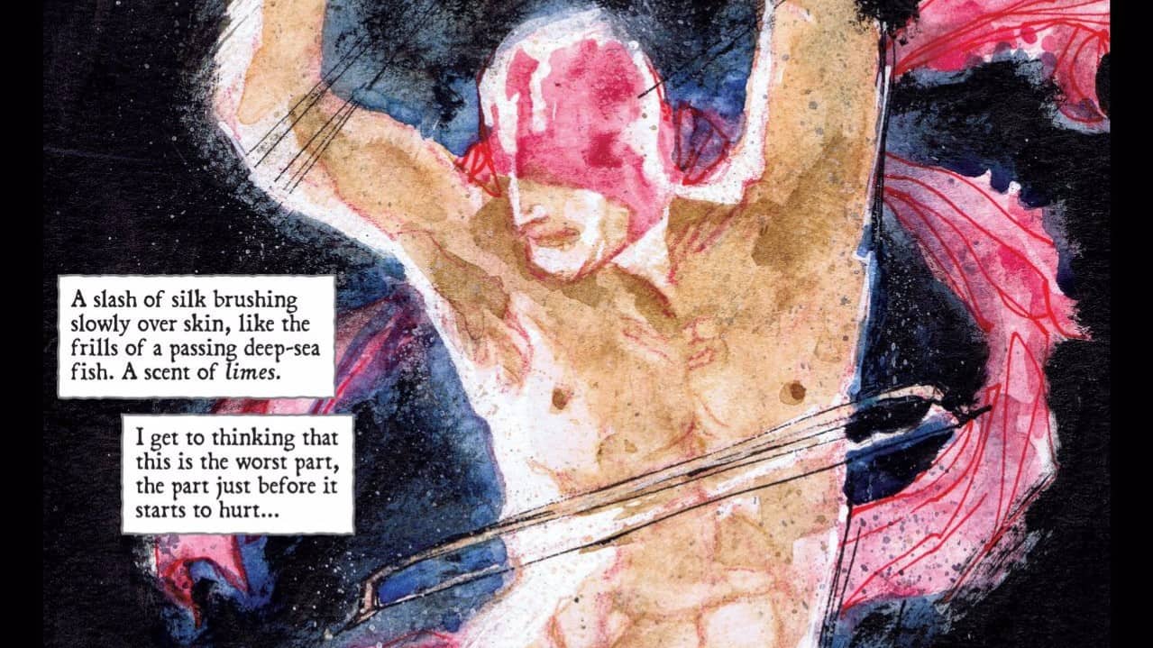
But despite the few progressions they make, their frustration mounts and, in the process of trying to find out why the temple is closed to them, they find the mysterious white flower named Trillium, a word they both recognize; Lemire’s impressionistic art explodes into a full page as they make the realization and, despite seeming obvious in retrospect, all of the previous was really well guided build-up. Then, the flower does something incredible that I won’t spoil but it’s quite startling in how quickly this story is moving without seeming rushed; credit must be given to Lemire for his immaculate pacing.
Fortunately, the flaws that held back the previous book are, with the second issue, far less of a concern. Lemire’s art style hasn’t changed and there are still a few moments where I craved a more substantial visual component. But because the story takes place entirely at the Temple and focuses on the interactions between Nika and William, there’s more subtlety that Lemire is better at conveying. Specifically, his slightly exaggerated characters are strong in their emotional expression, each respective revelation hitting harder. What I really love about what Lemire’s doing here are his layouts; they don’t pop but if you’re paying attention or you reread, you’ll notice a theme in the panel setups. Most pages are grids, punctuated rhythmically by circular panels that sometimes convey Nika’s visuals filtered through her sci-fi technology. As the story heats up, the circular panels become more prevalent, but what’s really cool is how Nika and Will’s respective perspectives are framed by unique backgrounds that disappear as the storyline finally merges with a massive two-panel climax.
So overall, Trillium’s second issue is a thrill that manages to meet if not exceed the quality of the previous issue. Alongside Collider/FBP, this series is set to take its place among the pantheon of must-read comics of the year.
TOM STRONG AND THE PLANET OF PERIL #2
Writer: Peter Hogan
Artist: Chris Sprouse
Colorist: Jordie Bellaire
Publisher: DC/Vertigo
Price: $3
I feel a bit bad about this series. I probably shouldn’t have started it to begin with; it’s clearly part of an ongoing saga with a long history. But I couldn’t resist the stunning artwork and the pulp hero aesthetic that I wish there was more of.
Unfortunately, like the previous issue, it’s pretty clear from the get-go that we’re supposed to be in on the background of Tom Strong and his heroic companions. The story continues as Strong and his brother-in-law land on the titular planet of peril that strongly resembles Earth, except populated by pulp heroes and currently struggling with a horrific plague. Strong is there to find Doctor Strange, his scientist counterpart, but after a run-in with two superheroes he has a history with, Tom is reluctantly forced to add saving the planet from the disease to his objectives. Most of this issue revolves around Tom encountering the Fighting Spirit and her partner The Terror. None of it is particularly interesting as it’s clear we’re supposed to be invested in their history together. As someone who’s never read a Tom Strong story before this one, I struggled to maintain interest, getting by on admiring the fantastic art alone. It’s not that the writing is bad; in Peter Hogan’s defence, I still WANTED to know what was going on. But that just doesn’t justify reading this series with no prior knowledge.
And it’s all really unfortunate because the art is fantastic, if not better than the previous issue, as it’s moved away from the neat but cliche sci-fi to a depiction of a dying planet. Sprouse is superb at backgrounds AND characters, filling his backgrounds with morose autumnal landscapes and wondrous castle interiors while equally grandiose pulp heroes expositing grandiloquently. There’s not a lot of dynamism in the panel layouts but when Sprouse does blow up a full panel it’s thoroughly magnificent.
There’s not much point in trying to talk my way out of this; I screwed up when I picked up this series and I don’t think it would really be fair to “execute” it persay without the caveat that fans of the original Tom Strong stories would probably be going nuts over this. As it is, my patience has worn thin and Hogan hasn’t really extended much of a welcome to new readers. Sorry, Tom Strong, but you’re just not strong enough to keep me interested.
 SHELTERED #3
Writer: Ed Brisson
Artist: Johnnie Christmas
Publisher: Image Comics
Price: $3
What a weird arc of feelings I’ve had about this comic. When it debuted, I was absolutely hooked by the first issue. But the second issue’s stagnant half-heartedness soured my enthusiasm somewhat, even as the plot itself continued dangling the ultimate question like a carrot, but a particularly appealing vegetable was what I’d hoped for. It was not what I got.
Issue three finds our protagonists getting the upper hand against the charismatic Lucas who had lead the bloody uprising against the adults of the survivalist community. With guerilla-style ruthlessness, they strike at the boys, who appear to be weakened by some vague crisis of conscience and leadership, in an attempt to escape the compound so that Victoria can get medical help for the ailing Hailey. Her search for a connection to the outside world leads her to a run-in with Lucas and the big reveal(?) where he explains the justifications for his actions. Predictably, he fits the mold of his parents too well, which is almost a let-down, even if it certainly fits the continually realistic depictions of the series. Vic responds with justifiable violence and escapes to leave Lucas declaring war on the rogue girls. Just when we think Lucas isn’t vile enough, we get a little twist at the end that lets us in on what the blonde-haired sociopath was up to on page one. It’s not a surprise but it does deepen the level of awfulness at play here.
And the art goes right along with that sense of encroaching misery, improving quite a bit this issue; artist Christmas gets to draw some dogs and does so enthusiastically, lending them a child-like innocence to contrast the sullen teens now taking care of them. Segueing into a bold, heaving depiction of violence a few pages later, he charges the scenes with powerful movement, contrasted moments later by Victoria sneaking through the compound in darkness, shadows contrasting her intensity. There’s another big moment later after Victoria attacks and Lucas is depicted severely bloodied, but his chill calmness despite this is quite unsettling.
Yet this can’t save a comic that is utterly dull. It’s a weird sort of dullness rooted in the predictable, cynical behavior of real human beings. Yes, I’m criticising SHELTERED for being too real. This is certainly a case where I could say that my desire for escapism in comics gives me an unfair bias against this title. But it isn’t even just that it’s unrepentantly, monotonously “real” but that it also bold, underline, highlights what is really awful about human beings in general. SHELTERED is basically ‘Lord of the Flies’ set in a survivalist commune. That’s not a good thing. I already dislike human beings enough already, I don’t need to be reminded why. Sorry, SHELTERED, but I’m putting you out of your misery.


