[Comic Execution] 3/21 – ‘GHOSTED’, ‘UNDERTOW’, ‘THE WITCHER’
Just gonna air a gripe here in the column for visibility’s sake: Dark Horse Comic’s app, for reading their comics digitally? It sucks. And I’m angry about it, but not just because it sucks. No, I’m angry because Comixology, which works wonderfully, is clearly the template for Dark Horse’s app. Dark Horse Comics apparently doesn’t care about convenience or, you know, being reasonable. They’d prefer to have their own app, one that sucks frankly, than participate in the Comixology ecosystem. It’s like… let’s say you’re a video game company and you’ve got some really great games, right? And there’s this huge, incredibly efficient, perfectly-organized distribution platform that would be perfect for your games and would put them right in the hands of gamers who desperately want to play them. But instead of actually using that delivery system, you MAKE YOUR OWN. And not only do you insist that everyone use YOUR delivery system for your games (and your games alone), but your own platform also SUCKS.
That’s you, Dark Horse Comics. You’re EA. And you know what? Nobody likes EA. Is that who you want to be? IS IT?
 GHOSTED #8
Writer: Joshua Williamson
Artist: Davide Gianfelice
Colors: Miroslav Mrva
Publisher: Image Comics
Price: $3 (Digital)
It’s deja vu time as we find ourselves staring down the barrel of issue #3 of GHOSTED’s second arc, asking that same question of the comic; ARE YOU MAN ENOUGH? What’s kind of bugging me though is that, now that I’m thinking about it, I think some of the other series that I didn’t execute have had second arcs. I know when ‘A Voice In The Dark’ kicks off its next arc, I’ll be reviewing that again, since my three-issue limit meant dropping it just as the second arc was getting off the ground. If we ever see another ‘Ballistic’ arc, I’ll be all over it like a tramp on chips. Same in regards to ‘Shaolin Cowboy,’ ‘Burn The Orphanage’ or ‘The Fox’ but I don’t think we’ll be seeing second arcs of ‘The Rocketeer & The Spirit,’ ‘IT CAME!,’ or ‘The Illegitimates’ any time soon. There are other survivor series, of course, but they don’t lend themselves to “arcs” as much. Regardless, I know there’s more ‘Burn The Orphanage’ in the future and I know for the fact that the next issue of ‘The Fox’ launches a new arc so expect more recurring series to give GHOSTED some company.
Does GHOSTED need company, though? It has been one of my favorite new horror comics in a long time, coming to occupy the same place in my heart as lovably weird horror movies like “The Re-Animator” or “The Frighteners.” But the latest storyline has gone to a different placed and introduced a lot of new ideas, trying to fill in the backstory of the protagonist, Jackson, while moving ahead with a “possession” tale, with a twist, of course. As Jackson is finally confronted by the morbid cult he’s stumbled onto, they immediately subject him to head games, further coloring them as more than the blood-thirsty freaks Jackson had initially pegged them as. Still, the opening bit is a bit of a head-scratcher; surely Jackson noticed they’d put a bulletproof vest on him before shooting him, thereby making his shocked reaction a bit weird? This was a weird bit of writing to kick things off with but it did serve to highlight how pragmatic the cult is, so I guess it worked.
The cultists get desperate and threaten him with “the darkness” which I can only hope isn’t the Top Cow character. We don’t get to find out, as an eyeless elder cultist deprives Jackson of experiencing said darkness, much to the amusing chagrin of his spectral companion. Writer Williamson keeps up the pace by jumping scenes to Jackson’s friend Trick and the gangster Skinner, whose unlikely pairing immediately made me keen on seeing what they’d do next, but all we get is Skinner slicing up some cultists and Trick devising a clever infiltration plan. I’m not even really sure what this scene was for, since it could’ve easily been implied later on that they killed some cultists and took their masks, rather than bore us with some rather tame knife-stabbing by Skinner.
The eyeless old man? Not even an actual character, I guess. Just window dressing. And hey look, more T&A that I don’t care about! Fortunately, it’s limited to a single panel, as we quickly move to a reminder that Jackson is there for a possessed girl, Nina. Though really, again, why do we need to be reminded of all this? A whole page dedicated to reinforcing what we already knew from the previous issue? This is really the first time I can remember Williamson’s writing being so obvious. Thankfully, the next page is a fun little introduction to the cult’s de facto leader, Maestro, who has some VERY interesting information to convey to Jackson. Apparently, there’s more than a couple of supernatural entities bearing down on Jackson, which is more than I’d certainly accounted for. But before any other revelations are spilled forth, we’re instead treated to the true purpose the cult, which is actually a pretty clever setup in itself, though I really hope it comes into play in the plot to come. Things begin to make a little more sense and suddenly we are treated to the real reason Jackson is here, even if he doesn’t know it, and with that, I have to say that Williamson really knows how to weave a deceptive narrative.
Then he throws in a flashback, of all things! But not even just a normal flashback, even THAT is part of the ongoing storyline, somehow. Outside the flashback, Jackson does his usual jackass thing, pisses off the cult leader, almost ends up facing the darkness but has his ass saved by, who else, Skinner and Trick. For a moment, it almost feels like the story is going to get moving again but the group splits up yet again, with Jackson chasing down Nina into a forest full of malevolence. There’s nothing interesting at all to me about the Jackson/Nina dynamic; I’d rather see what Skinner and Trick are up to than put up with more of Nina’s antics, even if she does finally reveal what the whole story is with her possession and how it’s related to Jackson’s past.
I feel like Williamson’s writing in this issue lost the momentum that had been driving the previous issues, particularly with Jackson being carted from place to place with no real sense of purpose, and there just wasn’t much that stood out, compared to what we’ve seen in the past. It also doesn’t help that Nina feels like such a bare, mechanical character who exists almost entirely to drive the plot.
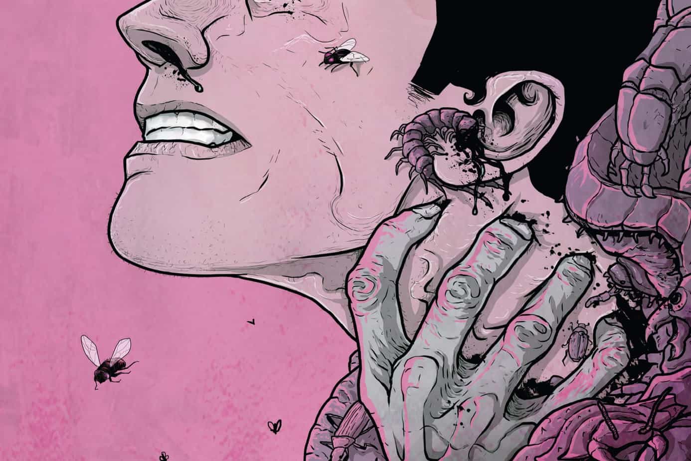
The art is still pretty good overall. There are some rough patches here and there, noticeably so. Sometimes the line art gets loose and characters faces, as well as their hands, appear deformed, and not intentionally so. But there are also some great visuals too, such as the possessed girl scribbling and drooling, the eyeless cultist, or the snake-filled throne room of Maestro. There’s also significantly more cheesecake than their was in the previous arc but it’s definitely cut down from the previous issue so that’s good.
This latest issue of Ghosted barely makes the cut, honestly. It’s definitely the lowest point for the writing so far and my gut feeling is that I’ve just witnessed Williamson treading water for the sake of pushing out the storyline a few more issues. I can also see artist Gianfelice is getting a bit fatigued, as his output is getting more uneven. That said, I still find myself wanting to see the next issue so GHOSTED yet again escapes the bite of my scythe’s blade, but this time it’s not unbloodied.
UNDERTOW #2
Writer: Steve Orlando
Artist: Artyom Trakhanov
Publisher: Image Comics
Price: $3 (Digital)
I think one of the reasons I’m so enamored of UNDERTOW only two issues in is that it’s one of the first comics I’ve read in a long while that feels like it could NEVER work as a live-action movie or TV show. I mean, I guess if you wanted to go to James Cameron’s ‘Avatar’-level CG, you might get close but it just wouldn’t have the same psychedelic aesthetic as the comic. But what’s interesting is that UNDERTOW feels like what Cameron tried to do with that movie but failed (speaking for myself only), mainly because he didn’t go weird enough and also because he could’ve tried a little harder to disguise his white man guilt theme. Like ‘Avatar’, there’s a political theme to UNDERTOW that drives the core of the plot, but UNDERTOW has far more to say than Cameron’s simplistic allegory. Similarly, there’s an exploration of what happens when human civilization interacts with tribal cultures, though UNDERTOW is only hinting at that for now. Much of the parallels are simply the nature of working the same genre of high-concept sci-fi but, again, if UNDERTOW is in any way intended to riff on ‘Avatar’ or perhaps Cameron’s superior underwater sci-fi thriller ‘The Abyss’, I’d be hard pressed to assume it as an influence in itself.
In particular, especially with this issue, the story deftly balances the present day above-ground adventure of Captain Anshargal and his away team with drama of the romantic and political aboard his ship as well as flashbacks explaining the origins of the main protagonist, Anshargal’s newest recruit. I’m hard pressed to image keeping all those elements in the air myself, much less keeping them as engaging as writer Steve Orlando manages. He keeps the world of UNDERTOW rich with detail without undermining the individual stories at play, each segment designed to either elevate the tension of the various conflicts or elaborate on previously unexplored character motivations. The characters themselves, while retaining some of the constant attributes ubiquitous to epic sci-fi, are colorful enough to escape the inertia of the tropes they’re born from. And by carefully ensuring that the core of the book is Anshargal’s dangerous search with careful pacing, Orlando prevents it from collapsing under its own weight.
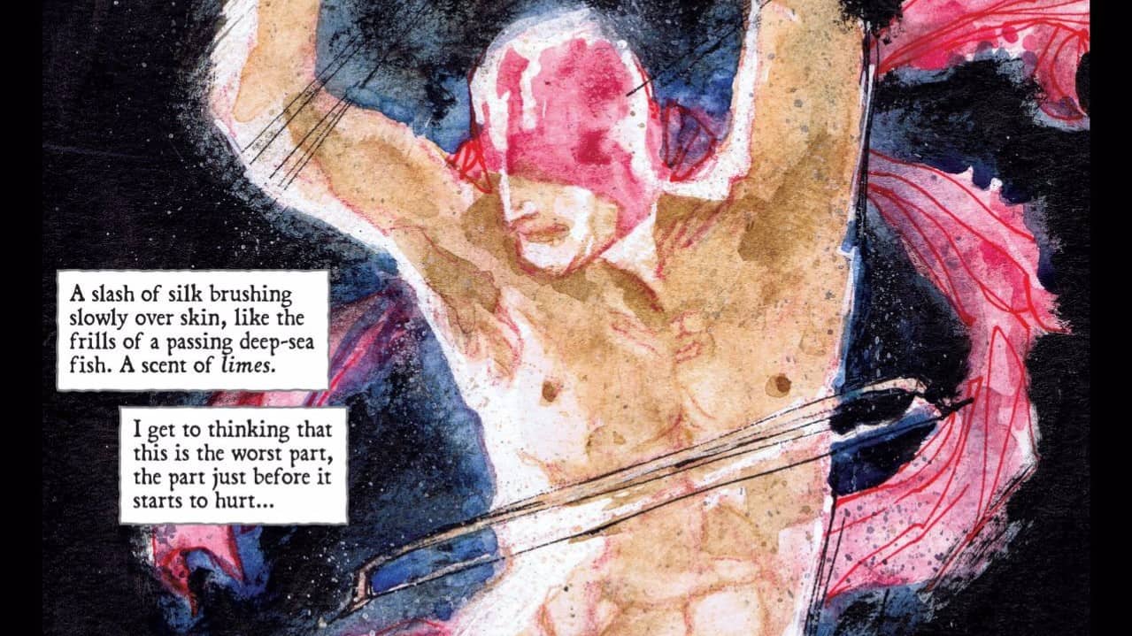
The continued insanity of artists Trakhanov and Mauer continues to be one of my favorite things to look at in comics, alongside Emma Rios’ ‘Pretty Deadly’ and Mathew Reynolds ‘The Mercenary Sea’. Sure, this is an epic sci-fi tale but they render it in the kind of feverish, daring hues that give ‘FBP’ and ‘Prophet’ a run for their money. And Trakhanov’s linework is just as energetic and huge as the first issue was. I mean, the more I look at these pages, the more awestruck I am by just how perfectly he manages to render the whole world of UNDERTOW, again bouncing from fascinating interiors to textured spelunking scenes, bring to life a terrifying sea locust as well as primitive human ancestors. The work ethic here puts most other artists to shame.
I do have one complaint about this issue of UNDERTOW, though, which is a shame, because I could easily call this a perfect comic book otherwise. My gripe is that, as a reader who doesn’t care about naked or sexy female characters, I’m feeling pretty marginalized. And, honestly? It takes more than something to set me off in this regard. But the pandering here is just takes up too much time and page space for me to just ignore. I mean, there’s the stereotypical “two characters just finished having sex and are still naked” and that’s fine except the guy is getting dressed as we’re introduced to the scene while the female character is still in nothing but underwear, and only half that. And it’s not just incidental; her nudity is the focus of several panels.
That’d be okay if it was just the one scene but then there’s a fight scene between the badass female character and a sparring partner and she’s wearing a leotard that barely hides anything, which is fine, but then here again, her body becomes the focus of the whole two pages of the fight. Even when the guy she’s fighting nearly loses his pants for one panel, it’s more embarrassing than titillating.
And it’s not like I’m being totally unreasonable: ‘Pretty Deadly’ manages to have requisite sexy time without forgetting that it can include men as well as women, as do several other comics. So I’m asking that the creative minds behind UNDERTOW look to the future with that attitude in mind; think about readers like me, who, despite their best efforts not to, can’t help but feel a little excluded in these situations. Hopefully, this doesn’t continue to be a problem with the next issue. If it does, though, I’ll definitely be executing it, because there’s no excuse anymore for excluding readers like me.
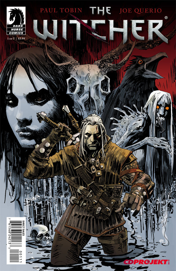 THE WITCHER #1
Writer: Paul Tobin
Artist: Joe Querio
Colors: Carlos Badilla
Publisher: Dark Horse Comics
Price: $4 (Digital)
I have no idea what to make of ‘The Witcher’, a video game from 2007 based upon a Russian medieval fantasy epic. It’s essentially Robert E Howard’s ‘Solomon Kane’ retold with some modern touches. Just look up Solomon Kane on Wikipedia. Got it? Okay, that’s the story of ‘The Witcher’ pretty much. Well, I guess ‘The Witcher’ himself has a different origin story than Solomon Kane; he’s more like Blade, in the sense that he has his own supernatural heritage that alienates him from mere mortals. But otherwise, it’s an almost identical setup. So what’s the big deal? I’m not honestly sure, except maybe that ‘The Witcher’ drew a lot of its menacing horror from folklore, which Robert E Howard wasn’t as inspired by.
The comic, THE WITCHER, is based off the video game, which is based off a series of novels, which in themselves are homaging/ripping off Solomon Kane. Also, apparently there’s been TWO comic book adaptations already, one based off ‘Witcher 2’… I don’t know, whatever. Obviously, I approached the comic with low expectations. It surprised me by kicking off with a light-hearted introduction to a hunter named Jakob who immediately runs into The Witcher, Geralt. They make friends, then The Witcher saves his ass almost right off the bat. I immediately wonder how the hell Jakob’s survived this long, given how oblivious he was to the nearby danger. Writer Paul Tobin manages to save the story from that stumble by giving Jakob a very interesting backstory. Obviously it’s just a hint of it for now but it’s so intriguing I almost forgot the preposterousness of this clearly incompetent “hunter” living in such an intensely dangerous world.
For a while, it seems that the story meanders, further coloring in the grim world of THE WITCHER, introducing us to one of the many creepy folklore-inspired monsters that you apparently can’t swing a dead cat without hitting. Also, the line “That’s no woman” genuinely inspired laughter from me. Like, Jakob, dude; you’re in a creepy graveyard in the middle of a very creepy forest. Why in the HELL does Geralt have to tell you that’s obviously not a women’s voice you just heard? And why did he have to say it in the cheesiest manner possible?
It’s not for a while until something actually happens, and while it’s nice that Tobin is trying to immerse us in THE WITCHER’s grimdark aesthetic but I got bored pretty quick, mainly because Geralt and Jakob’s banter wasn’t amusing. When something DOES start to go wrong, Jakob yet again lapses into moron mode: “‘Ancient things’? What do you mean by ancient things?” *facepalm*
What I like about Tobin’s monsters is that he never tries to scare us by showing us how evil they are, but just hints at it, and the evil creature they’re confronted by in the forest has a suitable aura of dread, and it’s good to see that Geralt isn’t some invincible badass who doesn’t have to run. And the last few pages are actually a thrill, as Tobin gleefully evokes classic Gothic horror.
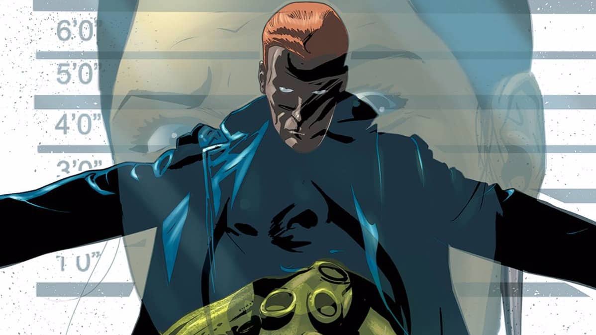
The artwork does a fine job of conveying the atmospheric menace of the tale. Artist Joe Querio expertly shifts the visuals between beauty and gloom, often evoking both at the same time with sparse but powerful establishing shots. But it’s also Carlos Badilla’s stark, captivating colors that boost the visuals to a more mature level, filling in much the details missing from Querio’s often muddled lines. There’s also some wonderful work by letterer Nate Piekos, especially early on, but for some reason, outside some appropriately ghoulish-looking word bubbles, his fun SFX are almost entirely absent. Is it to give an impression of the eerie silence of the forest in which the last half of the book takes place? I’m not sure I believe myself with that excuse, honestly.
I’m pretty disappointed in THE WITCHER, honestly. Tobin’s characterization of Jakob just seems out of place and implausibly dense and pretty much aggravates me every time he opens his mouth, while The Witcher himself is interesting enough but not enough to carry the story alone. I do like what Tobin is doing with the world-building though, and if the art was a bit better, I’d be in it for that aspect alone. Except the art is just flaky, thanks to the frequently sloppy lineart; there are at least a half a dozen panels where Jakob or Geralt, or both, don’t even get mouths or noses, that’s how rushed Querio seemed to be with this issue. And at $4, just for the digital copy, I expect better, 24 pages or not. Sorry, but even The Witcher can’t avoid my guillotine’s judgement.

