[Comic Execution] 12/9 – AvP, ESCAPE FROM NEW YORK, WOLF MOON
It’s such a wild idea to consider that two of my favorite writers are from Saint Louis and two of my favorite artists live in Missouri. It would be very easy to have an epic mini-convention here if I could ever get Chris Samnee, Jeremy Haun, Matt Kindt and Cullen Bunn to hang out in one place together. There’s a big convention happening here in September 2015, and they’ve confirmed the writing talents Matt Kindt and Cullen Bunn but Samnee and Haun seem to be a bit trickier. How does one trick an artist into attending a convention? I mean, we’ve already got a bunch of artists but I can only assume they’re all suckers or gluttons for punishment. I’m talking, how do you ensnare the jumpy ones? Should I set up some kind of trap using a box, a stick, some string and maybe a Wacom tablet as bait? Has anyone ever actually managed to keep a comic book artist in captivity for long? What do they even eat?
ALIEN VS PREDATOR: FIRE AND STONE #3
Writer: Christopher Sebela
Artist: Ariel Olivetti
Publisher: Dark Horse Comics
Price: $4 (Digital)
It’s part of one of “Let’s Talk About How Great Christopher Sebela Is” here at Comic Execution. Well, I mean, he does share my first name so that’s about as solid a reason I need myself. It’s too bad he’s from Portland, a city that we established is actually a Canadian city pretending to be in America. But come on, that’s not such a big deal, I mean, look at Toronto, there’s a Canadian city clearly attempting to pass itself off as being in America, even going so far as to fake a drug-addled mayor addicted to attention, much like the mayor of Portlandia. No, that’s not a misspelling, I’m talking about Kyle MacLachlan.
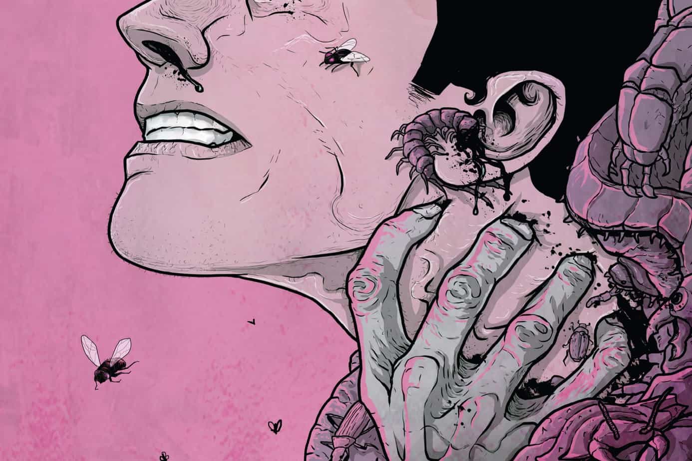
But really, Sebela one of the things I don’t talk much about Sebela is that he seems like he’s actually having fun when he writes comics. AvP is a perfect example of this; the delirious interactions between Elden, the Predator, the xenomorphs and the accelerated Predator are nearly slapstick in their abrupt, explosive violence. If not for the ultra weird, unsettling body horror on full display throughout the comic, you’d be forgiven for thinking this was a comedy. It’s mostly Elden finding, in this issue, that everything changes and he’s totally unprepared for his sudden dethroning as king of the alien creeps. Then there’s Francis and the Predator and their awkward, one-sided relationship, if that’s what you could call it. In most stories where this many alien forces end up in conflict, it’s just everyone at each other’s throats, but Sebela knows that there needs to be context for these battles. That said, it’s not entirely clear why Elden’s lost his power, or why he’s changing shape again, but I might just not be picking up on that detail. It’s also a bit confusing as to why Francis waited until now to extract the filtered accelerant from Elden and even stranger is Elden’s sudden returned concern for Francis. The whole things gotten kind of messy but it’s enjoyable chaotic and I bet the final issue in the series will tie it all together handily so no big deal.
Thankfully, artist Ariel Olivetti returns once again with his grand, over the top art. With a half dozen different kinds of creatures running around, it’s truly astonishing that he manages as much sturdiness and narrative solidity without giving up too much visual energy. It’s obvious he does get a bit sloppy here and there but you’d only really notice it if you looked closely and even then, it’s totally forgivable given how he still makes every panel sing. Accelerated Elden looks even cooler in this issue than he did before, shedding his humanity almost entirely. We get to see more of the accelerated Predator, way more, and its awesome in all its badass, nasty glory. All the praise I’ve given Olivetti in the past issues applies here; fun layouts, perfect colors, great character expressions, it’s all here. Nate Piekos nails it on the lettering again, giving the gory, squishy action a proper treatment.
Sebela and Olivetti’s AvP is, without question, my favorite thing to come out of Fire And Stone, honestly. This issue might suffer just a little bit under the weight and density of its contents but it still is way too much fun to complain about a few small problems here and there. Heck, I’d be all about this comic if it were just Francis and Elden and their twisted, unsettling conflict, but mixing in Predators, xenomorphs, etc. This comic proves that comics can be way better than their cinematic brethren when handled properly.
WOLF MOON #1
Writer: Cullen Bunn
Artist: Jeremy Haun
Colorist: Lee Loughridge
Publisher: Vertigo
Price: $4 (Digital)
I’m doing something I said I’d never do. I’m lifting my review embargo on Vertigo Comics. You know it’d have to be some kind of comic to make me do this. And Wolf Moon is that comic. What makes this comic so special? First and foremost, it’s a werewolf horror comic of the old-school, traditional variety; bloody, no-holds-barred and in-your-face. Second, it’s written by Saint Louis comic luminary Cullen Bunn, whose The Remains and The Empty Man has appeared in Comic Execution before. But it’s also illustrated by Jeremy Haun, also a Missouri artist! So, yes, we here at Saint Louis-based Destroy The Brain literally had no choice but to review this comic. Let’s see if it’s worth destroying our indie cred for, shall we?
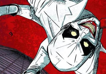
Cullen Bunn, like Christopher Sebela, is known for taking a certain genre (in his case, horror) and delivering nuanced advancements without abandoning what makes the genre great. Wolf Moon might be his best example of this so far. The story opens with a very cliche set up and proceeds to embrace expectations, pitting an enigmatic werewolf hunter against a very serious killer werewolf. The dialogue, as is usual with Bunn, feels natural and sharp and he also surprises his readers by refusing to back down from the true carnage that a werewolf on the rampage should incur. But halfway through the book, Bunn puts a frankly brilliant kink in the traditional tale that gives the werewolf monster a whole new life and really ups the stakes for the conflict between the hunter and his inhuman target. Obviously I can’t give this away but what’s really crazy is that this isn’t the only surprise Bunn has in store for his readers. Unlike his The Empty Man, the intensity of Wolf Moon is actually benefited by the sharp turns of these riffs on the werewolf mythos, making the story more than just unapologetic violence and ennui. The last page, much like with Escape from NY, is so weird and unexpected that it’s hard not to be frustrated that there’s not more.
Artist Jeremy Haun is one of the best in comics right now, and I’m not just saying that because he’s from our fair city. His style is detailed but controlled, expressive and illustrative, his characters benefitting greatly from being brought to life by an artist who is immersed in the Midwestern setting that the story resides in (I should add that this applies to Bunn’s writing as well). Colorist Lee Loughridge delivers right alongside Samnee, and unlike Escape from NY’s colorist, he laces Samnee’s brutal gore and violence with nightmarish hues that amplify them hugely. Bouncing from nauseating greens to chilling purplish-blues, Loughridge makes the visuals an emotional rollercoaster, his unflinching crimsons verging on black screaming with each slash and bite. Letterer Travis Lanham refuses to be the weak link, consistently focusing on each panel from page one on, his detailed sound effects bursting from the page in every situation it could (and should) be present, giving yet another layer of power to Wolf Moon.
There is one problem with Wolf Moon: it’s a Vertigo comic. Because of this, unlike either of the comics I’m reviewing this week, there is an abundance of ads in this issue, interrupting a bold, bullet-train narrative constantly with ads that are, frankly, insulting. And the comic is, worse, the same price (and in the case of AvP, more expensive) as the other, ad free. But it’s not as bad with this debut issue of Wolf Moon as it has been in the past; the biggest chunk of exposition is mercifully pure, preventing any loss of momentum that would’ve resulted if the ads had punctured the more delicate moments. Wolf Moon is succeeding onto the next issue because it’s 24 pages of the best werewolf horror comic I’ve ever read (and dare I say, of all time), no flaws to be seen. Well, except maybe that there’s no diversity, but Bunn has time to introduce characters besides generic hicks and angst-ridden werewolf hunters, which I hope he does.
 ESCAPE FROM NY #1
Writer: Christopher Sebela
Artist: Diego Baretto
Colorist: Marissa Louise
Publisher: BOOM! Studios
Price: $4 (Digital)
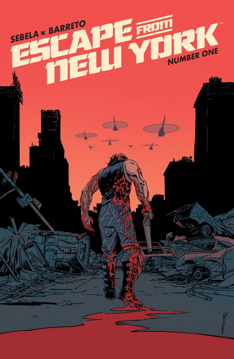
It’s been a Christopher Sebela kind of year. Back in May, I reviewed Ghost, his collaboration with Kelly Sue DeConnick at Dark Horse, and then in October I took on his Alien vs Predator, whose third issue I’m reviewing in this week’s column as well. I’d heard there was a comic book adaptation of Escape From NY happening but I didn’t know it was going to be written by Sebela so when it landed on shelves this week, I knew it was going to have to be a part of this column. It would be a criminal sin against everything Destroy The Brain stands for if I didn’t review it.
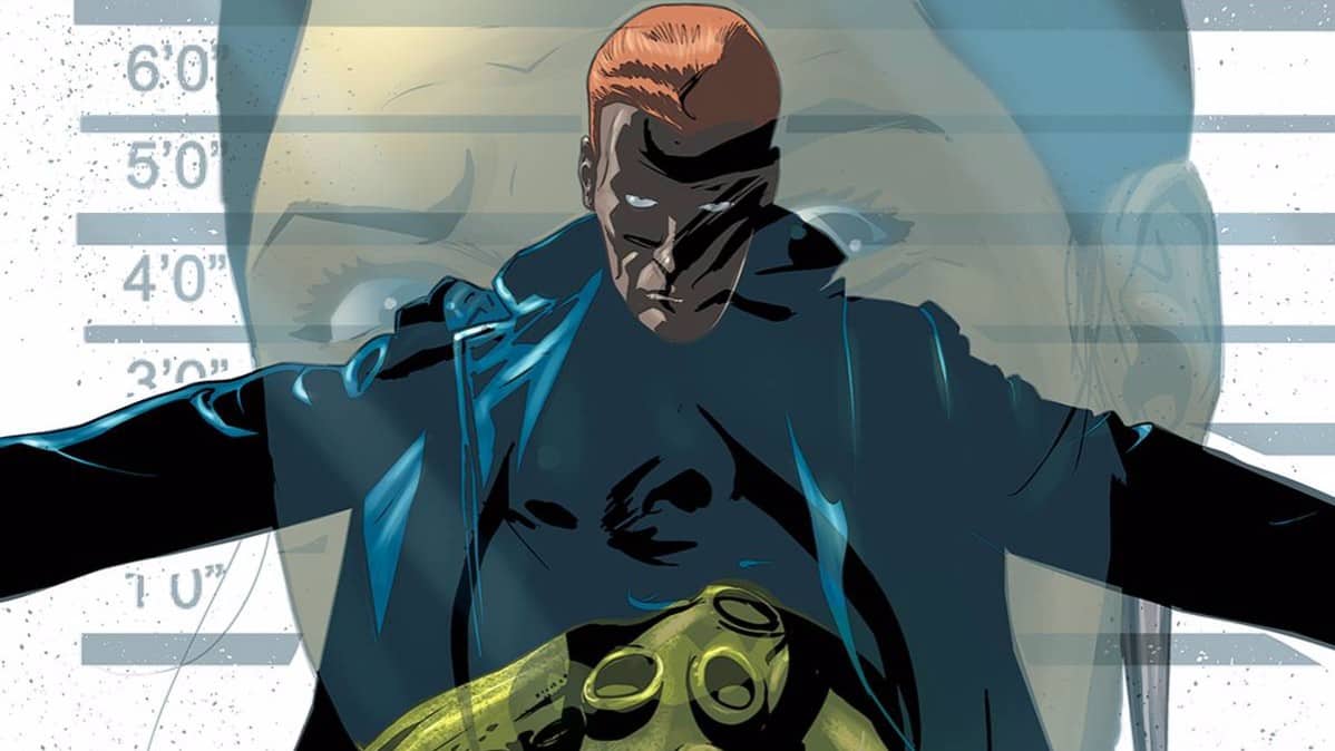
Writer Christopher Sebela is notorious for his ability to seamlessly blend pulpy, thrilling action with narrative depth and solid characterization, and his take on Escape From NY is no different. It kicks off properly, the way a John Carpenter movie would, with some kick ass tunes and someone being thrown out of a moving vehicle. Sebela takes full advantage of the safe assumption his readers know the premise of Escape from NY and sets us in the moments immediately following the first film. Anti-hero among anti-heroes Snake Plissken is immediately on the run, handily wiping out a dozen US Army soldiers and crashing a helicopter in record time. It’s very satisfying that Sebela immediately establishes Plissken not as an perfect badass but one who makes mistakes that he barely walks away from. But Sebela has the added advantage of being able to overlay the action with exposition and he uses that to its full extent, giving us a clearer understanding of what’s led to this point.
That’s not the least of Sebela’s ambitiousness though. He wastes no time in packing Plissken’s post-apocalyptic USA with colorful denizens, all of whom perpetually threaten the eye-patched bastard while peeling back the layers of weirdness that Sebela knew Carpenter simply didn’t have the time to expose on camera. There’s more than a bit of Mad Max to Sebela’s realization of this brave new USA, though it’s more an amalgam of all the classic post-apocalyptic exploitation films, really. Despite the ever increasing level of detail filling the background of Escape From NY, the momentum that the first few pages generate never drains completely, though the seeming incoherence of each event, while implying a larger plot at hand, does require some patience, but I believe this is in favor of a payoff in later issues.
Artist Diego Barreto is fully capable of handling what Sebela is laying down, his art style having a classic pulp comics feel but never feeling rushed or lazy in its simplicity. Instead, there’s a compact energy in each panel, much like Carpenter’s more conventional films, with each panel imitating a cinematic perspective rather than trying for the more artistic take a comic book could offer. Some might be disappointed by this rigid, traditional visual narrative but there’s also something to be said for getting the visuals in and getting out of the way, suiting an Escape from NY story better than something more florid. It’s a testament to the efficient, page-turner of a narrative that, after all the craziness that goes down, the last few pages makes me wish it didn’t end where it did.
Some of the issues with the art lies at the feet of colorist Marissa Louise. From page one on, she blankets each panel in muted grays and browns, trying to evoke the grimier, industrialized nastiness of the films but forgetting that Carpenter offset this by punctuating this murkiness with unsettling bloom of hallucinatory colors. Hopefully the next issue will see the energy level pick up on the colors. The lettering, by Ed Dukeshire, is so good it’s hard to distinguish what he contributes from the hand-drawn lettering by Barreto without looking closely. In fact, it’s the colorful, high-impact synergy of Dukeshire and Barreto that elevates the visual storytelling. But what’s weird is that their work seems to disappear at times; a panel with gunshots or an alarm is perfectly handled but when a helicopter crashes and explodes, there’s no sound effects at all?
BOOM! delivers 22 pages of solid action and pulpy goodness, well written and illustrated with strong effort, but this title does run $4 dollars, the price of a premium comic, and while the art is good, it’s so busy just getting the visual information out there that it never gets the chance to be as great as the story itself. That said, Sebela’s story is, like his AvP, a commendable tour through the places we wish Carpenter could’ve explored in his movies, and that’s totally worth the price, assuming he keeps that level of creativity in the following issues.

