[Comic Execution] 12/12 – ‘DEAD BODY ROAD’, ‘SHAOLIN COWBOY’, ‘KRAMPUS’
So the holiday season is in full swing and we’ve gotten a few inches of snow around here. Something doesn’t feel right though. I can’t quite put my finger on it but the seasonal wackiness just hasn’t kicked in yet. Maybe it’s lulling me into a false sense of security. Maybe it’s lurking just around the corner, crouched in the dark, glaring at me with dead eyes of coal, drooling in anticipation (egg nog saliva, of course) and tightly gripping a peppermint candy cane of knee-capping density. Or maybe it’s been inside me all along, like a wriggling parasite of feverish, materialistic glee, waiting for the right moment to paralyze me with a flood of giddy, unsolicited warmth and I find myself suddenly compelled to buy gifts and watch ‘It’s A Beautiful Life’. Or maybe ‘Gremlins’.
Uh-oh.
 DEAD BODY ROAD #1
Writer: Justin Jordan
Artist: Matteo Scalera
Colors: Moreno Dinisio
Publisher: Image Comics
Price: $3
Writer Justin Jordan is best known for his ultraviolent ‘The Strange Talent Of Luther Strode’ but I was first introduced to him when he was brought on to write the new ‘Shadowman’ comics for Valiant. As a longtime Shadowman fan (thanks, Acclaim!), I was both trepidatious and enthused; the artist chosen to accompany his pen was a great one and Valiant’s first two relaunches, ‘Harbinger’ and ‘X-O Manowar’ were both smash hits. But I hadn’t read Jordan’s ‘Luther Strode’ but knew it was infamous, being compared in some places to ‘Kick-Ass’, which didn’t strike me as the kind of comic I’d want to come from the writer taking over such a property. Fortunately I had nothing to fear, as Jordan crafted a ten-issue run of wild and weird supernatural action with a sense of humor and a reverence for the source that didn’t get in the way of fresh perspectives.
After doing a second Luther Strode series, it seems Justin Jordan is continuing his manic pace with another limited-run title, one that seems to deviate from his theme (at least in his creator-owned stuff) of weird, absurd violence. Instead, he’s going for realistic, gritty violence! Which is actually really kind of exciting because, as ‘Shadowman’ proved, he is adept at anything action-packed.
Dead Body Road is definitely action packed. Jordan uses his opening page to build suspense, introducing us to a hacker doing something with a computer that he probably shouldn’t be doing. I love the restrained dialogue, having him say something as private as “Yes, beautiful” really sells the scene because the next two pages are the falling hammer striking the chamber; the hacker’s partners-in-crime are standing around a sprawl of corpses. It’s an electric moment that I totally caught me by surprise and I have to really commend Justin Jordan for that. The next few pages slows things down by introducing us to the protagonist, who is (unfortunately) suffering from an acute case of dead girlfriend, one rather coincidentally killed in the aforementioned heist. Granted, These symptoms include; being consoled by a black friend, having stubble and a Jersey Shore haircut, wearing a plain t-shirt and generally being uninteresting on the whole. The hilariously melodramatic portrait of him and his dead girlfriend/wife kind of stopped me dead. I’m really hoping that we get some kind of plot development that makes all of this heavy-handed grieving seem less annoyingly rote in hindsight but we’ll see.
Fortunately, it’s a short three pages of this before we’re back on the road with the escaped hacker, who our anti-hero is staking out. It’s a real shame I know this hacker is gonna die because he’s way more interesting than the anti-hero; his response to a black vehicle bearing down on him is both appropriate and succinctly witty. Throughout the extended car chase, he continues to be the most amusing element, outside of the protagonist gleefully brandishing a shotgun. Which is highly inappropriate; that’s why you’re supposed to have someone riding SHOTGUN. You amateur. But yeah, the chase ends and we’re shuttled to a pretty little cafe where the ringleader of the heist gets some choice dialogue. Jordan might not have the most interesting characters but he writes dialogue with the charming intensity of Tarantino. Unfortunately, unlike Tarantino, Jordan seems to have a callous disregard for his female characters; the second one to appear ALSO has a terminal role. I’m really hoping the second issue introduces a woman with some actual depth and narrative importance because otherwise I’m going to be very sad at Justin Jordan.
So another character gets introduced, somewhat more interesting than the protagonist but not by much. Jordan uses the action movie hierarchy of bastards to impress upon us how scary this dude is, even going so far as to have a character beg him for death. If it wasn’t for the one really horrendous (and unrestrained) mutilation he enacts on his victim, I’d be unimpressed but, uh, I should probably warn you that this is not a comic for those of weak dispositions. There’s a slightly less brutal kind of interrogation going on between the hacker and his ex-boss, who really honestly kind of sucks at getting information from people, though in his defense, he probably shouldn’t be doing the interrogating anyway. Something about this guy reminds me, really a lot, of Clarence Boddicker from ‘Robocop’ so, despite his implausible incompetence, I kinda like him. We get a few pages of dialogue-free action before the main character gets to do some interrogating of his own. Jordan twists the knife in my gut by making the hacker that much more relatable in the last few pages. What Jordan sets up in the last page does hint that we’re going to meet a much more interesting female character though, unfortunately, the anti-hero is tasked with protecting her while continuing his vendetta. I’m already picturing the bad guys taking her hostage and using her against him, which will INFURIATE ME if it happens.
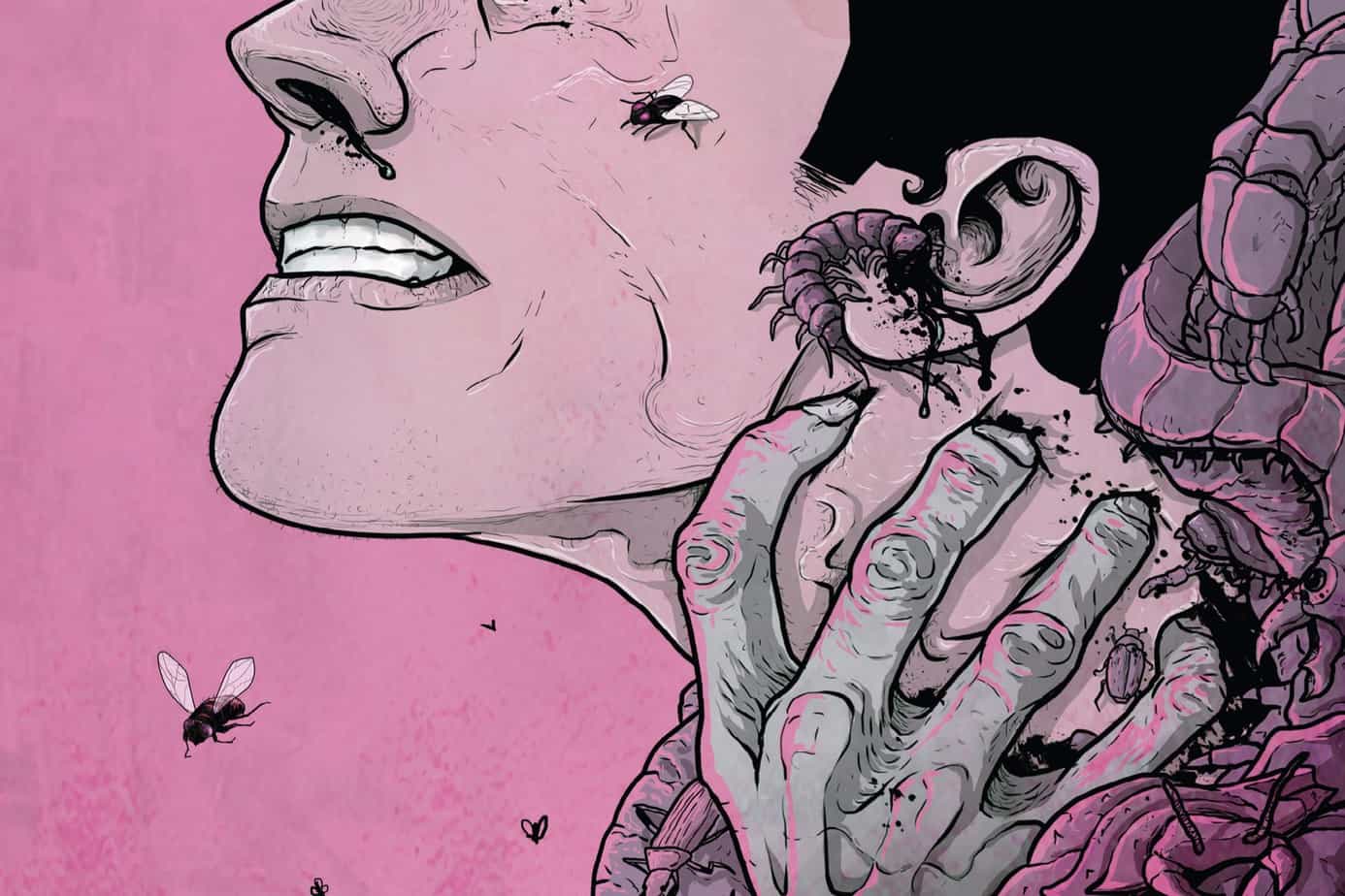
Matteo Scalera launches DEAD BODY ROAD into the atmosphere, though. Every panel feels like a scene from a widescreen film, veering from intense closeups to huge scenes of highly detailed carnage, and that’s the first two pages. His characters are easy to parse, their faces drip with bold emotion, every background is richly populated. Scalera handles guns, cars and gore with equal grace, no mean feat considering he also packs his action scenes with dynamic POVs and furious lines. He does drop the elaborate background work during his action scenes but this is standard for even the most talented artists and he does it in a subtle way that you wouldn’t notice unless you were looking. He doesn’t break his standardized panel layouts but occasionally, though when he does it’s for a big moment, which is actually great because those scenes need the impact to stand out. Now, his work is enough to elevate the book above its mundane trappings but then colorist Moreno Dinisio comes in and just drops bombs all over the place. His use of contrasts is sharp but never heavy, he brings boldness where needed while steeping the contemplative stuff in moody grays and browns. He uses shadows to great effect but never relies on them as a crutch. There’s a scene where a character is being viewed through a pane of shattered glass and Dinisio nails it, conveying the intensity of the situation. Wide shots have all the refined palette needed to set the scene while faces are rendered in close up with immaculate delicacy. Scalera and Dinisio should get high praise all around for making this a truly heart-pounding thrill ride.
That said, I really hope the next issue steps it up on the writing. Jordan seems to be coasting on action movie tropes here and that’s not good enough. What he writes in ‘Luther Strode’ and ‘Shadowman’ is clever and potent but I’m not seeing that writer here, in this issue at least. That being said, this is also only a $3 book and that’s really the price of the art alone so maybe Jordan’s just having fun. At that price, there’s no reason not to have fun right along with him. But if the price of entry does go up, I’m not sure I can condone his brand of mediocre, disposable fun.
SHAOLIN COWBOY #3
Writer: Geof Darrow
Artist: Geof Darrow
Colors: Dave Stewart
Publisher: Dark Horse Comics
Price: $4
I feel at least a little bit sensationalist reviewing SHAOLIN COWBOY. While I certainly believe that every comic should be reviewed, this one has managed to create such a huge stir (but not huge enough) that it doesn’t really need my mostly useless input to heighten the fervor. That being said, I’m still kind of surprised by how little discussion there is regarding this series, both at my local comic book shop and online. Sure, there’s been plenty of reviews, both negative and positive. But I’m not seeing any back and forth. The problem’s not at all unique to this comic; the general state of pop culture criticism on the Internet has just about everyone posting their opinions and nobody analyzing those opinions. But I digress; I thought surely THIS book would incite at least a low hum of contentious responses but it was marked only by a lot of “this is shit” or “this is brilliant” posts.
In light of this, I’m going to get a bit deeper with this issue than I would normally, focusing less on the quality of the writing and art and more on the more esoteric elements. But for those of you don’t care for such tedious contemplation, I’ll summarize my traditional take on this issue; the writing is significantly more accessible and Darrow uses a brilliant pair of flashback panels to great effect and his art, as usual, is unbeatable. Is it worth the price? Depends on how willing you are to examine and think about your comics.
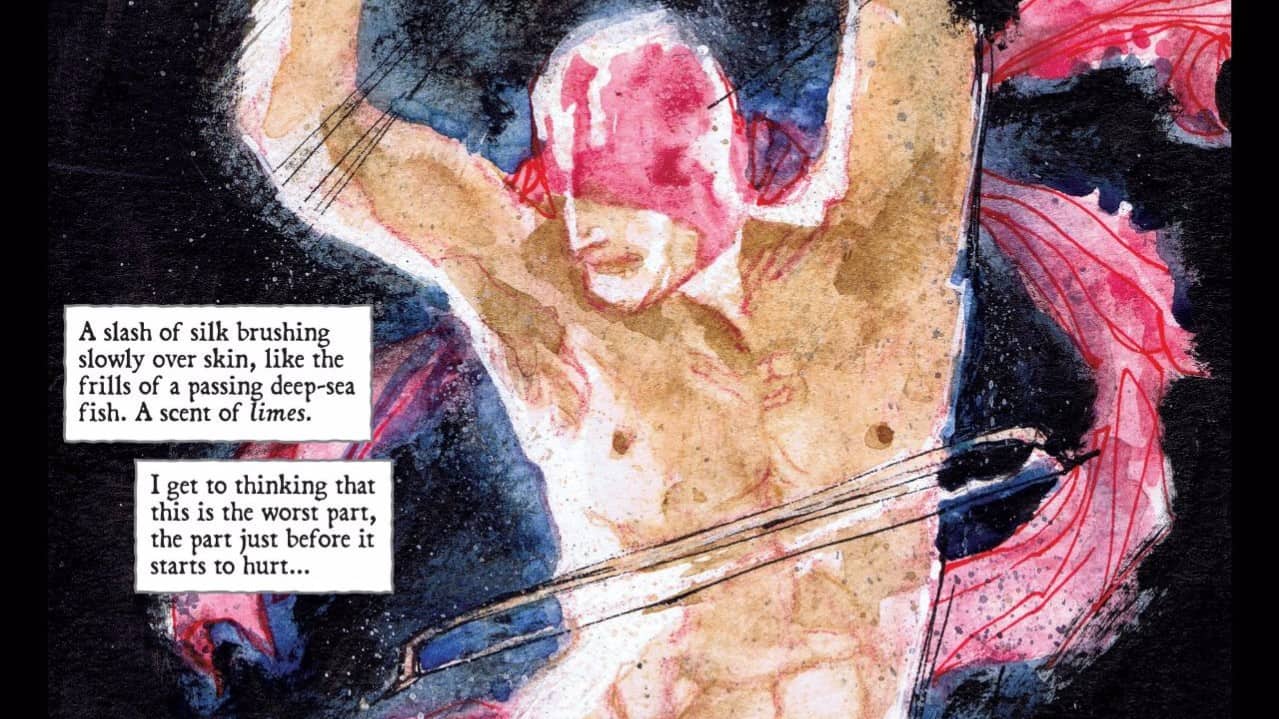
For my part, I found a lot to explore and chew on in this issue. I will say that I was a little disappointed that the first half of the comic was simply an extension of the previous issue, wherein the Shaolin Cowboy’s chainsaws gradually run out of fuel. But I’m also willing to forgive this as I suspect this continuation is the result of splitting what was meant to be one graphic novel into several issues. But, as with the former, I also combed these pages for the amusing little details and I was not disappointing. With this issue, we see the introduction of zombie pets? I assume they’re pets, though they could just as likely be wild animals. And yes, the Shaolin Cowboy chops them to pieces as well. I think their presence is the result of Darrow getting a bit bored of just drawing humans but maybe they’re an indicator that the Cowboy has killed so many human zombies that they’re sending animals after him.
What’s REALLY amusing is that there’s a living turtle crawling on the ground amid the dense mob of undead. You have to actually look for it to it, but it’s there and you can follow it from page to page, though you’ll eventually lose sight. Regardless, it’s very surreal to see this totally normal creature trying to make its way across the desert while this utterly insane massacre is going on above it. I think it might be some kind of visual metaphor for the Cowboy himself, but that’s stretching it even more than the dead animals theory, especially as there are a pair of desert lizards that show up near the end of the book, to which I refuse to assign any kind of meaning. But as I amusingly contemplated the true meaning of the turtle, I had a revelation.
Throughout this entire story, there’s been only one other constant besides the zombies and Shaolin Cowboy; litter. For some reason, the desert in which this all takes place has been blanketed with trash. Given that there’s a road nearby, I simply assumed that was Darrow’s reasoning for it being there and left it at that. But by now, I’ve started wondering. Why’s be bothering to consistently draw the trash in every single panel where it could be visible? Why is it EVERYWHERE? But it wasn’t until I considered the Shaolin Cowboy character himself, a paragon of self-control and transcendent dignity who would never litter that I came to the conclusion that the trash is supposed to be an accusation, a sort of visual scene-of-the-crime for all these zombies. These were once people and those people are where this waste came from.
One of the flashback panels has a monk asking, “Do you find more water at the top of the ocean or at the bottom?” and I think that clinched the metaphor. Darrow is basically saying that Shaolin Cowboy is fighting an endless battle, one he can’t win. Thus, the second panel; “Nobody wants to die, but if you have to die, die last.” His Shaolin training shows him that he can’t hope to defeat this “enemy” but his cowboy code tells him that he can’t die before he’s put as many of his foes to rest as possible. Essentially, he comes to the conclusion that he’s going to die trying to stop the tide of the undead. It’s actually a very poignant moment, heavily contrasting the previous issue and everything that comes before it in this one.
The fact that I really had to think about these things, that Darrow didn’t lead me by the hand, is really a big deal for me. Even the weirder stuff I’ve reviewed in this column still worked to present a coherent narrative and clear themes. But this book doesn’t do that at all. If Darrow has anything to say, he’s doing it with admirable restraint, burying it under the absurd violence that paints every page. I was recently lamenting, to myself, how I have no difficulty finding challenging music and films but rarely pick up a challenging comic. This one does just that, and I want to genuinely thank Darrow for doing just that.
 KRAMPUS #1
Writer: Brian Joines
Artist: Dean Kotz
Colors: Ron Riley
Publisher: Image
Price: $3
Of all the things I imagined someone would make a comic out of, Krampus is not one of them. I heard about Krampus for the first time about six years ago, thanks to a friend researching alternative/pagan traditions around Christmas time. The more I read about Krampus, the harder I found it to believe that any culture actually perpetuated such a terrifying myth beyond the dark ages yet Krampus is celebrated in Europe to this very day! How fucking metal! Pretty sure I can move to Europe if I marry someone there, right? Any single Polish gentlemen out there interested in being legally bound to a semi-adult, irresponsible slacker from America?
Of course, Brian Joines doesn’t quite stick to the traditional Krampus folklore. His Krampus has more of a Hellboy-ish quality, and his captors, the Secret Society of Santa Clauses, don’t appear to be as admirable as you’d expect, bickering amongst themselves and generally being useless against the mysterious terror that has left one of their ranks out of action and, more importantly, stolen the bones of St. Nicholas! Thus, they recruit Krampus to investigate and put an end to the threat. The set up is brilliantly absurd, mostly thanks to the incredibly eclectic ranks of the Secret Society of Santa Clauses (SSSC) itself, comprising Santa Claus equivalents from far reaches like Afghanistan, Netherlands, Japan and the USA, not to mention that their role seems to be more of a spy agency than a gift distribution organization. Their dialogue is fairly humorous but it’s really the ratcheting levels of goofy plot twists that kept me interested, especially when the SSSC use a “Naughty Bomb” (*snicker*) to keep Krampus from reverting to his mean old self. That said, I do wish there had been a few more laugh out loud moments but as a story centered around a very novel gimmick, it’s really well constructed and evolves at an energetic pace.
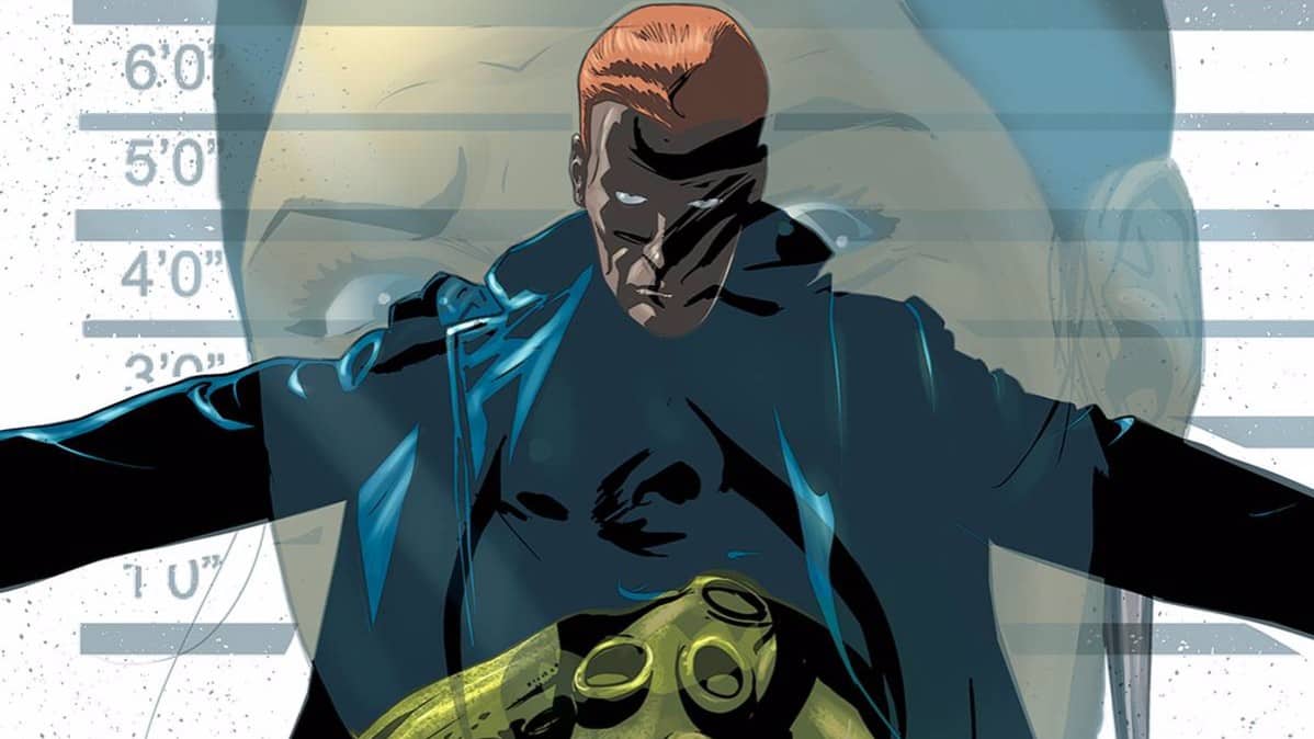
Dean Kotz handles the holiday-themed weirdness capably, giving each one of the Santas enough distinctiveness to set them apart without creating too much business. His sugar plum fairies are fun but definitely a bit too much and really cramp the panels, though fortunately they’re only featured briefly. His rendering of Karmpus’ hound, Stutgaard (to which I can find no reference on the Internet) is pretty awesome, his wide-eyed menace somehow both charming and unsettling. There’s a lot of little details that Kotz manages to slip into a lot of the panels and if it wasn’t for the fact that he occasionally lets things get a little too sloppy, I’d say he does a perfect job. Ron Riley’s colors are good, building atmosphere where needed and keeping the whole affair suffused with vitality but there’s also not a lot of contrast or any real sense of energy.
Krampus is more than the sum of its parts, though. Maybe it’s just because it feels like a holiday-themed comic for those of us who are a bit cynical but I feel like it has more heart and charm than it has any right to. It also doesn’t hurt that it’s cheap at $3 a pop for a full-sized comic with no interruptions. If you want something light, humorous and a kickstart for your holiday spirit, you should definitely pick this up. Then watch Gremlins. Unfortunately, the series is going to run past the holidays so we’ll see how well it fares post-New Years. Lets hope it has enough comedic brilliance up its sleeve to maintain my amusement when I’ve lost what little sentimentality I have for snow and sleigh bells.


