[Comic Execution] 11/24 – LITTLE NEMO, THE STORYTELLER, PREDATOR
It’s a bit of a puzzler why I find myself reviewing comics for kids on a website called Destroy The Brain. Not that I’m going to pretend that none of my readers have kids and would be interested in comics for kids. But the weird thing is that I don’t have kids or ever want to have kids. It’s nothing personal, kids. I’m just barely responsible enough to manage my own perpetual catastrophe (aka life) so there’s a snowball’s chance in Hell I’d be capable of doing so for another lifeform, much less want to. But! I do have two nieces and two nephews, the oldest of whom is just the right age to read comics! That said, I’m not actually sure the comics I’ve reviewing are up his alley honestly, as he’s more a superhero fan than anything. But there is definitely an audience among younger readers for these comics, no doubt, but I review them mainly as a way of verifying that I can evaluate comics outside my comfort zone. Don’t expect it to become too much of a thing, as I still need this column to fit mostly into Destroy The Brain’s horror-focused format.
And, honestly? Nothing’s quite as horrifying as the thought of actually buying comics for your own kid.
PREDATOR: FIRE AND STONE #2
Writer: Joshua Williamson
Artist: Chris Mooneyham
Colorist: Dan Brown
Publisher: Dark Horse Comics
Price: $4 (Digital)
I am getting just a little bit tired of this Fire And Stone crossover. Not in the sense that it’s not exciting to see what they do but publishing reviews is a bit of a hassle. It’s mainly just keeping track of who’s writing and illustrating what but there’s also the fact that I’ve executed two of the four titles. I won’t be reading Aliens or Prometheus and that’s going to put a stumbling block in the way of me knowing what’s going on in each issue, especially as the events of the surviving series happen after the events of the executed series. Somehow, I don’t feel like this is coincidence. I mean, if you were going to launch a massive event but only had a budget for something half as grand, you’d do your best to reassure that your audience had to experience(purchase) the sub-par work to enjoy the top tier efforts. But what’s frustrating is that, if they’d had artist Juan Ferreyra of Prometheus work with Aliens scribe Chris Roberson, they would’ve had three solid series. Instead, the visual splendor of Prometheus was dragged down by Paul Tobin’s bloated script (highly unusual for him) and Roberson was saddled with a lackluster illustrator.
Thankfully, Predator is here to show us how it’s done right. Joshua Williamson writes this story as campy and ridiculous as a comic called Predator should be, but doesn’t forget that it should also be AWESOME. The opening sequence, for example, not only sets us straight as to why this particular yautja (it turns out this is the actual alien name for what we call “Predators”) is after an Engineer but gives us a thrilling fight scene as well. By setting the stakes at the beginning, Williamson makes the bickering between protagonist Galgo and the yautja I call Gouge (for the missing eye) seem more humorously trivial than it would’ve been. I’ve been gawking at the magnificently warped Elden in AvP comic but thankfully, the relationship that develops here between Gouge and Galgo is definitely bromantic and whether Williamson meant it or not, it’s utterly charming. Their adventure together unveils what’s been going on LV-223 after the events of Aliens, though it doesn’t make much sense without having read the rest of that series but thankfully, another battle interrupts this, giving us the joy of seeing Gouge and Galgo fight side by side (literally). And when we hit the last page, Williamson absolutely knocks it out of the park by introducing the one thing that would make this comic perfect; a badass female warrior
Chris Mooneyham is in perfect sync with Williamson, his lines having just the right balance of energetic expressiveness and detail solidity, never failing to convey expressions even during scenes of intense action and elegantly handling something as challenging as the alien forests of LV-223. Colorist Dan Brown whips up a storm on each page, not relying too heavily on a particular range of colors for each scene but still augmenting the emotions of those scenes with subtle variations of hues. Last issue I attributed to Nate Piekos the lettering of which I was so enamored, and that same high quality work is present in this issue. However, as I’m exposed further to this lettering, I’m beginning to suspect, based on the art itself, that the lettering is hand drawn by Mooneyham. If it’s not, Piekos deserves massive props for seamlessly integrating his work into Mooneyham’s art. If it is, so much more praise to the illustrator.
This is only the second issue of Predator: Fire & Stone and it’s hard to be enamored of what’s been shown here so far. Even as I switch back to paying for the more expensive digital version of this comic, I don’t feel the twinge of buyer’s remorse I did when purchasing Aliens or *wince* Prometheus. But I will say that while I will continue to review the third issues of Predator and AvP, whether you as a reader should go out and purchase them (rather than, say, wait for the cheaper Fire And Stone trade paperback ) is entirely dependent on how much more of these comics you want to see. But as a critic, I can only beg you to go out and buy these issues before they’re gone, because their creators deserve the recognition.
LITTLE NEMO: RETURN TO SLUMBERLAND #2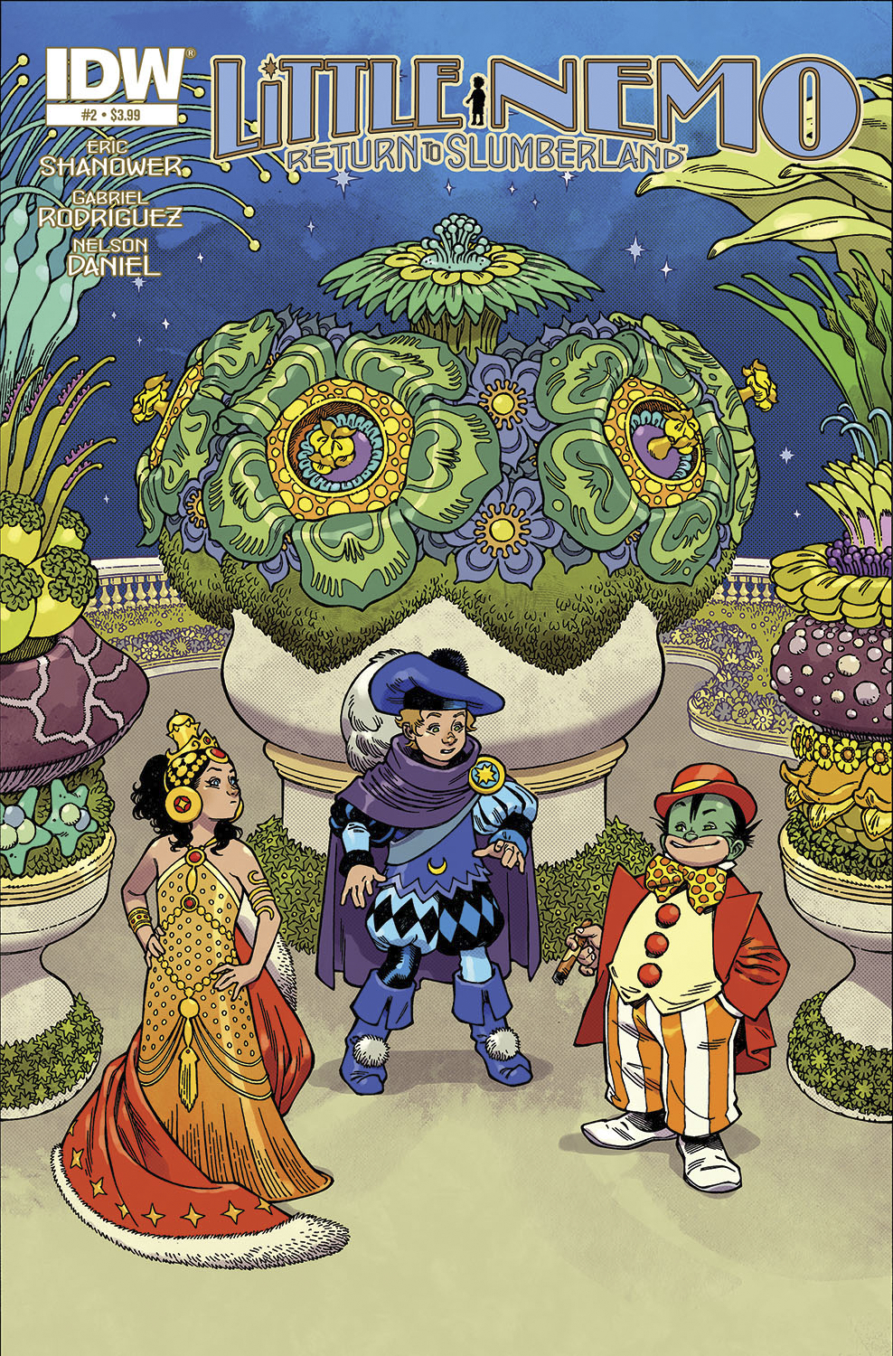
Writer: Eric Shanowar
Artist: Gabriel Rodriguez
Colorist: Nelson Daniel
Publisher: IDW Publishing
Price: $4 (Digital)
It’s quite the juxtaposition, artist Gabriel Rodriguez going from the acclaimed Locke & Key to, of all things, Little Nemo. In case you weren’t aware, Locke & Key is considered one of the best new horror comics in a while, written by no less than Stephen King’s son, Joe Hill. I haven’t read it myself but having flipped through the comics, I’m a bit puzzled why it’s so unanimously praised; Gabriel Rodriguez’s style in those pages is quite a bit more stylistic than it is here, giving away his manga influence openly. It’s jarring initially but I suspect that passes as the engrossing story absorbs the reader. Which is why I was so surprised that Rodriguez modified his style for this series to match original Little Nemo artist Winsor McCay, despite the fact that his default style would suit a kid-friendly book just as well.
Eric Shanowar writes us into the moment we’ve been waiting for since the beginning of the first issue, in which “Nemo” finally enters Dreamland proper, but it still takes a few pages to fully get there, starting us (as I suspect most issue swill) in the “real world.” Shanowar stretches out the climactic introduction by putting an awful lot of goofiness in the way, including a manic parade and a clever riff on bureaucratic absurdity. It’s actually played to the hilt by Shanowar, going to so far as to place a hilarious impassable length of slippery glass between him and the princess and by that point, the annoyance becomes obviously purposeful and enjoyable cheeky. We also see, as this is going on, the introduction of Flip, a trouble-maker whose presence presages the return of Nemo to the waking world, setting a countdown of sorts in motion. But Shanowar is playing with his audience and, despite the build-up, the meeting of the Princess and Nemo isn’t a huge deal; Nemo nearly overcomes his resentment but Flip steps in, only to once again sidestep expectations by utterly failing to trick Nemo into waking up and doesn’t do so great at making friends either, leaving Nemo trapped between two people he’s not all that fond of, yet he expresses remorse upon waking. Through all of this, what’s impressive is how cleverly Shanowar upends expectations but does so in a way that’s subtle.
Gabriel Rodriguez finally gets to sink his teeth into the full majesty of the palace of King Morpheus, though the parade he illustrates leading up to it is so intensely colorful, it sets the bar quite high. In particular is the Royal Inchworm, a gloriously silly visual treat that only the most sad and jaded of humans will fail to be enchanted by. As it transports Nemo, the background is filled and refilled by a cavalcade of beautifully absurd creatures; stilt legged revelers, winged pixies, and that’s not even mentioning the lush backgrounds they’re emerging from. This bombardment of character-saturated backgrounds continues right into the palace and on through to the climactic meeting. all of this is superbly, almost supernaturally brought to life by colorist Nelson Daniel, whose directness belies a stunning range of subtlety, managing to render Slumberland as colorfully as possible without hurting the eyes. The letting in this issue is a bit confusing; at times it looks like it’s hand drawn by Rodriguez and colored by Daniel but other panels, the lettering is clearly done by Robbie Robbins after the illustrations are complete.
I don’t know that I can say enough good things about this issue. After going over it again and again, I honestly can’t think of anything I could complain about. Is there enough lettering? Maybe not for my tastes but I think Rodriguez and Robbins might be aware that not all readers click with rambunctious lettering like I do. Is this a good kids comic, though? Depends on how much credit you want to give your kids. I think it’s 9+ stuff, for certain, as some of the comedy and definitely the dream-narrative would go over the heads of younger readers. Little Nemo: Return To Dreamland is the kind of comic that Adventure Time‘s intended audience (middle-schoolers) should go nuts over, as should any of the show’s older fans. And, bonus, it’s some of the most incredible comic craft on shelves right now.
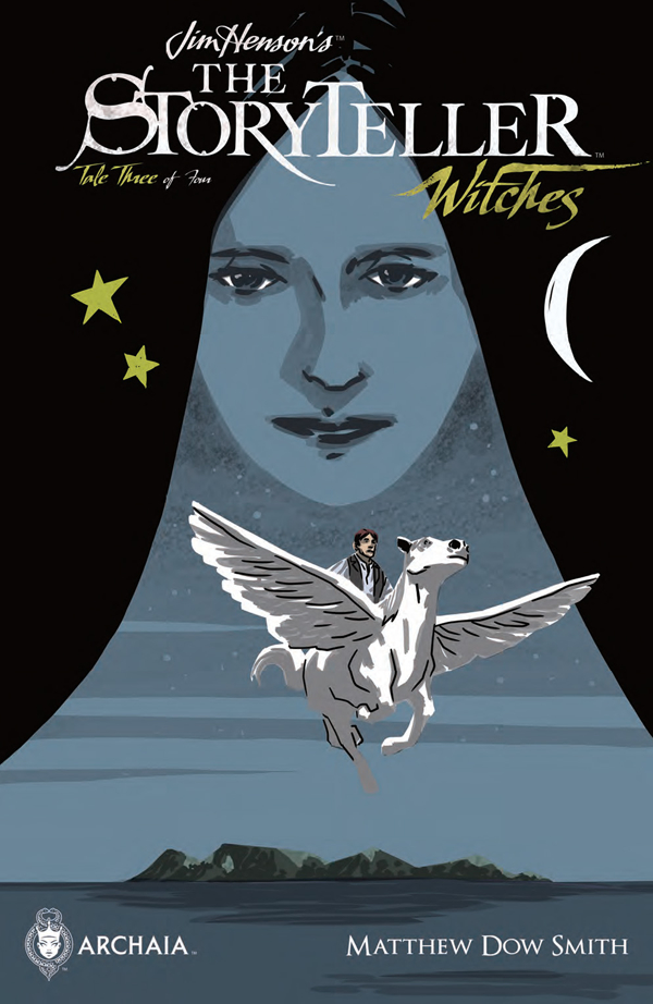 JIM HENSON’S THE STORYTELLER: WITCHES #3
Writer: Matthew Dow Smith
Artist: Matthew Dow Smith
Publisher: BOOM! Studios
Price: $4 (Digital)
I need to go back and rewatch a few episodes of Jim Henson’s The Storyteller because it’s been such a long time, I don’t even remember what the stories themselves were, I just remember the opening, and only vaguely. I’m not really sure it’s worth revisiting but I definitely don’t remember it being as good as this comic is, and while it’s not impossible for the comic to have completely surpassed the source material in terms of quality, it would certainly be disappointing. Then again, I don’t think I’d really want to compare Return to Slumberland to the original Little Nemo, not because I don’t think the former could hold up to the latter so much as I’m not sure I could appreciate the original as an artifact of its time.
In particular, I wonder if the original The Storyteller tv series was clever as these comics have been. The first two issues, written by SM Vidaurri and Kyla Vanderklugt, were forward-thinking without abandoning the traditions of what The Storyteller established, imitating classic folklore and fairy tales. This issue, written (and drawn) by Matthew Dow Smith, has the trappings of a fairy tale but aims for deeper, more complex territory. The first thing I thought of when the story ended was Inception, in the sense that there was a story being told by a storyteller who was within a story also told by the storyteller (of the title). The surface level narrative is about a mystical isle of imagination that comes to rely on the tall tales of a marooned sailor to rebuild itself but when he has to leave, what becomes of the isle? Smith, thankfully, doesn’t try to wrap his symbolism in layers of detail and fully embraces the meta-narrative that’s at work, so the tale moves quickly and, much like the issue before this one, goes to a bittersweet place. What I like about his story is that it’s very clever but not so clever that it fails to be direct, which means the denouement has a sting to it. It might lack the color and texture of the previous entries of Wytches but it makes up for it by being, as I said, VERY clever.
Matthew Dow Smith’s art, on the other hand, is a far cry from the intriciate, beautiful efforts of the previous issues. His lines are heavy and dark and they override so much of the details that he strives to impart into each scene that it’s difficult to enjoy the visuals. It’s not that he doesn’t know how to draw, but it just looks as though his drawing software doesn’t have a line thickness setting, so there’s very little nuance. This is only enhanced by the very plain, basic visuals of the story, lacking entirely the whimsical imagination of the previous issues. Even worse, the coloring doesn’t have any life to it either, washed out and lifeless. It’s not that the work seems unfinished or immature but that it’s disappointingly low-energy and glum, particularly coming on the heels of the thrilling works of SM Vidaurri and Kyla Vanderklugt.
This issue of The Storyteller sees a pretty drastic drop in quality, unfortunately. While the writing is very smart, it’s also not something a younger audience would appreciate, at least not in terms of how it toys with meta-narrative. This is compounded by art that is so frustratingly bland compared to what came before it feels like the series just ran out of budget completely. And the price didn’t go down with this issue so it’s a bit difficult to praise this issue at all, given how great the last two were. But here’s the thing; there’s one more issue left in the Jim Henson’s The Stoyteller: Witches series and if it (as I imagine) return to the glory of what this comic did before, I can’t condone skipping it simply for this misstep. As hard as it was to enjoy this comic, issue #1 and #2 easily earned the series a reprieve and I’ll suggest, on good faith alone, that you, the reader, keep your eyes peeled for the final issue of the series and pick that up instead of this one.

