[Comic Execution] 10/17 – ‘IT CAME!’, ‘SHAOLIN COWBOY’, ‘COFFIN HILL’
We’re nearing Halloween and here I am, two weeks behind. It occurs to me that it would be appropriate if I were to be executed myself. But then, you wouldn’t have my column to read, now would you? What’s that? Well, yeah, I know you haven’t been able to read my column for a while but… look, just put the machete down, we can talk this out. I promise it won’t happen again? *gulp*
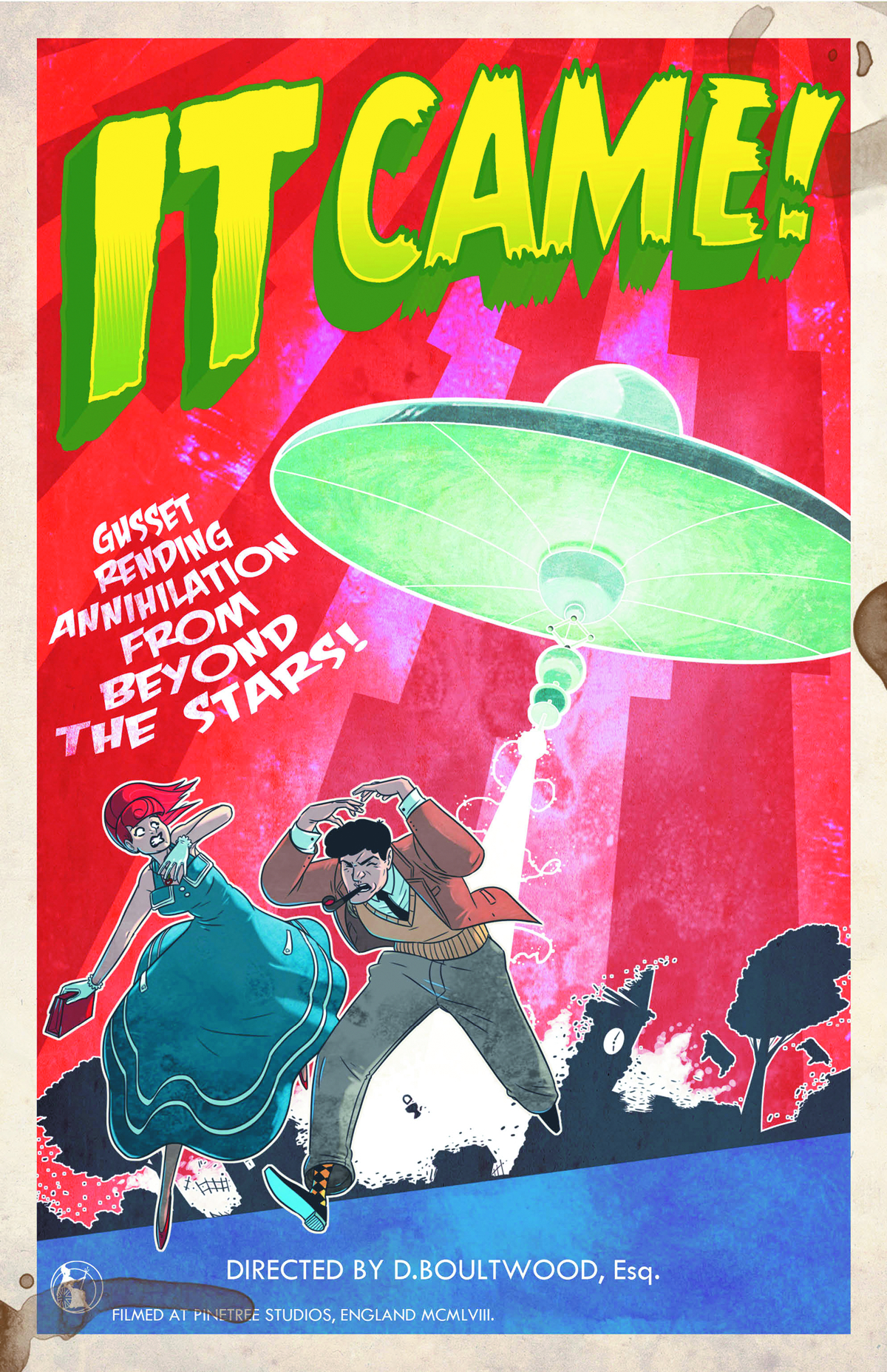 IT CAME! #3
Writer: Dan Boultwood
Artist: Dan Boultwood
Publisher: Titan
Price: $4
It’s been a pretty solid couple of issues for this very British sci-fi satire and I’ve been surprised to find myself looking forward to each issue more than the last. Granted, it’s only been three issues but it’s still a surprise, given how left-field the comic is. So let’s look at the third issue and see if it’s been worth the wait.
After the gonzo events of the previous issue, the writing here has to keep the momentum up and from page one, it appears to do so. The two protagonists, Dr Brett and Doris, escape the spaceship they’d been in and almost immediately are being chased, again. There’s a lot of running from things in IT CAME! and that’s not bad at all; the pacing of the dialogue and the panels themselves maintain a sense of urgency that belies the satirical tone of the story. After the chase ends, there’s some pretty hilarious dialogue as Dr Brett and Doris investigate a mysterious alien pod left behind. Eventually, the pair arrive at a military base where we are treated to more chuckleworthy interactions between them and the army buffoons. Mayhem ensues as the UFO attacks, leaving the base in ruins but the protagonists unscathed. It’s all written with just the right tone of parody, both envoking and subverting classic B-movie sci-fi that any cinephile should be familiar with. Given how difficult it is to pack this kind of humor into comic format, Dan Boultwood should be applauded for doing so.
BUT THAT’S NOT ALL! Dan’s responsible for the art, as well! What an renaissance man, right? I’m not even joking though. Let’s talk about why the art for IT CAME! is just as good as the grin-inducing writing. First, the use of a CG UFO complete w/ hanging string is a wonderful touch, adding just the right element of 4th-wall-breaking silliness. But it’s also used well; in one scene, it looms just over the roof of a building, almost glaring at the innocent bystanders below. Even at the climax, there’s a near-full page shot of it hovering over the military base and it actually feels gigantic, almost imposing, despite its silliness.
The linework itself is still just as sharp, crisp and jaunty as in prior volumes, so no complaints there. The humor is conveyed not just through brilliant scripting but also with lively character expressions, giving the delivery maximum impact. There’s a bit of sameness here that is easily overlooked on a first read but second looks reveal the limited range Boultwood has when it comes to visualizing reactions. Fortunately, he makes up for it with a grand climax full of exploding vehicles, fleeing soldiers and lasers flying everywhere. The viewscreen that the robot uses to target the army base has a hilariously old-school Atari feel I had to highlight. Overall, despite the lack of color, the book still looks fantastic and keeps right up with the action.
And I can’t fail to mention the “advertising” scattered throughout. It’s all very 4th-wall-breaking, with a poster announcing a dinosaur-packed adventure movie with a very awesome tagline. There’s a couple of pages of extras in the back featuring a UFO diagram and a riff on the collectibles-packaged-with-weird-products era. All that said, you get a sizable comic with a cute bit of fluff with the two meager ACTUAL ads saved for the very last. Not intrusive at all.
Overall, I’m hugely satisfied with IT CAME! Someone online cited Mystery Science Theater 3000, in their review of the first issue, as something it was akin to. While I hesitate to COMPARE it to the frankly incomparable MST3K, IT CAME! certainly has a level of quality and charming silliness equivalent. I think it actually does a fair job of linking Monty Python’s quirky British satire with the Hollywood parody of David Zucker (AIRPLANE, KENTUCKY FRIED MOVIE). So yeah, I love IT CAME! with an exclamation point.
SHAOLIN COWBOY #1
Writer: Geof Darrow
Artist: Geof Darrow
Colors: Dave Stewart
Publisher: Dark Horse
Price: $4
Ooops, my bad; apparently, it’s THE Shaolin Cowboy. As if there were multiple cowboys of the Shaolin variety. Actually, that sounds pretty awesome. But fortunately, the comic I’m about to review is also pretty awesome, so no big loss.
SHAOLIN COWBOY is written and illustrated by Geof Darrow, a guy who was apparently responsible for some of the conceptual work of ‘The Matrix’ as well as Big Guy and Rusty the Boy Robot. Darrow is loosely associated with Frank Miller and, like Miller, it’s kind of a big deal when Darrow creates a new comic. Though SHAOLIN COWBOY isn’t technically a ‘new’ comic; it had a short run in 2005 that won an Eisner. This is a continuation of that book but apparently is also intended as a jumping-on point for those who missed out on the original (guilty as charged). I’m a huge fan of Darrow’s first Eisner winner (of three) called Hard Boiled, written by Frank Miller, so I picked this up pretty eagerly.
It starts off with two pages nearly full of impossibly tiny text describing the events leading the Shaolin Cowboy to his current situation. Don’t be fooled though; most of this stuff is just silliness that Darrow churns out for his own amusement and while some of it is seriously brilliant, it’s also really hard to follow and, I’ll admit, I couldn’t read it all in one sitting. But you don’t have to at all, really. I don’t think so, at least. You could probably just read the last few paragraphs and be all right. Do that.
Beyond that, the writing isn’t much more coherent. The Shaolin Cowboy appears to escape from an underground chamber, chased by a zombie horde. There’s no real sense of danger from them as he appears to outrun them easily but it’s also obvious that there’s no end to them either. It seems like we’re just going to witness him fleeing across a desert until a car full of morons gets involved and the Cowboy has to intervene. There’s zombie slaying of the best possible kind, followed by a cut to a space station where people trying to find the Shaolin Cowboy find him, thanks to his heroism. It pretty much ends there. So there’s not much in the way of plot. Fortunately, the book is PACKED to the GILLS with all kinds of weird nonsense; a man gets his finger stuck in a can, a video of said zombie slaying goes viral and the best part might be the conversation we witness between the two dweebs spying on Shaolin Cowboy. It’s not our world, but it’s nearly as awful.
The real pull of SHAOLIN COWBOY is the art. I cannot stress to you enough how INTENSE Darrow’s art is. Everyone should see his artwork at least once in their life. He packs more lines in one panel than most artists manage in a full page. There are a few parts when the sheer density gets frustrating but that is easily outweighed by the soaring beauty of Darrow’s desert, contrasted by his genuinely unsettling zombie horde. There’s nothing ordinary about Darrow’s illustrations; his Cowboy is a weirdly chunky dude whose posture and expressions are amusingly exasperated just about constantly, assisted by a tired looking outfit. In fact, a lot of what populates Darrow’s world has a delightfully real feel, as though everything was worn a bit AFTER it was drawn. There’s a pretty serious scene of insane zombie gore, nothing horrifying but certainly a bit gut-wrenching and quite a bit impressive. There honestly isn’t much else I can say about Darrow’s art that won’t seem like butt-kissing. He’s really just that good. Dave Stewart, stalwart colorist, deserves accolades for seamlessly bringing the lines to life with an entire spectrum. It’d be hard enough to find someone willing to fill in Darrow’s madness; Stewart manages to actually upgrade the whole affair. It’s Eisner winning artwork, no doubt.
I love this book. It’s really intelligent, self-indulgent to the point of excess, incredibly strange and utterly unlike anything out there. It’s telling that Darrow is a big fan of French comics and their complete disregard for conventional comic book mentality. Dark Horse gets a big huge hug from me for not only making this widely available but getting out of Darrow’s way with only two adverts at the very end, a pinup gallery and giving Darrow a page to spread the news about his charity. It’s worth the $4 asking price, really. You’re either going to love Shaolin Cowboy or you’re not going to understand it. I really, really hope you love it as much as I do. Let’s hope Dark Horse keeps the price low and continues to make this a must have.
 COFFIN HILL #1
Writer: Caitlin Kittredge
Artist: Inaki Miranda
Colors: Eva De La Cruz
Publisher: Vertigo
Price: $3
Before I started writing a review for this high profile Vertigo book, I did something I don’t normally do; I looked at other reviews for it. Why? Because I really didn’t like COFFIN HILL. At all. But I was at least a little bit concerned that I was biased because A) I clearly wasn’t the book’s target audience B) Vertigo had wedged annoying previews for it into other titles. To my dismay, MOST reviews were positive, if remarkably vague (as most comic book review columns tend to be). But the review for COFFIN HILL at the VERY high profile Comic Book Resources slammed it with an analysis that echoed my own, and from someone I (perhaps wrongly) assume is part of the target demographic (young women). A couple of other smartly worded takedowns of COFFIN HILL later and I decided to ask around from people I knew who weren’t invested in comics. Turns out they weren’t much fond of it either.
The problems are almost entirely the fault of the writer, Caitlin Kittredge. I have no idea who she is as of the writing of this review. Let me do a bit of research here… As I had surmised but not confirmed, she writes urban fantasy YA novels with titles likes ‘Nocturne City’ and ‘My Big Fat Supernatural Honeymoon.’ I was unaware of this before I read the book, assuming Vertigo had too much dignity for these kinds of shenanigans. I was wrong.
The first page shows us a girl frozen in a lake. It’s a remembrance of our protagonist, Officer Eve Coffin, who’s celebrating solving a string of murders. A news story in the background fills us in on the details of the case and it’s then implied that Eve doesn’t really feel like she’s solved anything. Naturally, the majority of the male cops at the celebration are unpleasant caricatures except for the one nice guy (her partner!) but at least they’re all attractive-looking and not just the nice guy so there’s that. The next scene is an apartment where a man is holding a woman at gunpoint when Eve arrives to get shot. He’s a drug dealer who thinks the woman took his stash. Eve’s implicated somehow.
(MILD SPOILERS!)
What follows is a neat visual: a bullet hole in a pane of glass whose shards are all Eve’s memories, and beyond the shattered glass are the doctors announcing that she’s alive. Nothing about the memory fragments on display make any sense. Their circular pattern would seem to imply a sequential narrative but there is none. It’s certainly impressive, though.
Next up: a flashback, ten years ago, opening on another cool visual spectacle of the majestic Coffin estate, zooming in on the arriving guests then focusing at the bottom of the page on teen Eve applying makeup. In the background, a man and a woman get hot and heavy, the man trading barbs with Eve. Is it her brother? The dialogue doesn’t really clarify for sure but it does awkwardly imply that the woman is Eve’s friend’s mother… I think? There’s so much vagueness in the entire scene that it’s maddening. Eve leaves and uses what appears to be a bit of magic to gain access to a mysterious book.
Here’s something that really gets my goat about this page; the mysterious book is actually highlighted by a big black circle. The only reason the circle seems to exist is to explain to the readers that “hey this book is really important.” Which is really insulting; anyone with half a brain can infer that she’s broken into the room for it. But what’s also silly is that this apparently important and (as we learn later) dangerous book is SITTING OUT IN THE OPEN. I mean, even if you’ve locked the room it’s in, WHY WOULD YOU LEAVE IT IN THE OPEN? You’ve locked the door because you think someone would want to get at what’s in the room and if the book is the most important thing in the room, wouldn’t you take the extra precaution and HIDE IT SOMEWHERE?
Moving on. But to the party; we meet Eve’s parents, both terrible people, of course. Eve makes a spectacle of her exit, having apparently never been locked into her room as was originally intended. So yeah, her parents are really awful people and she’s rebelling. They’re all magic users too, I guess? Eve’s grandmother is dead and the girl uses her tomb as a hiding place for booze and pills, we are shown on the next page, which is pretty awesome actually, though we are left to wonder whether there’s actually a body in there. From beyond, the grandmother warns Eve with a flock of crows, a nice touch.
(REAL SPOILERS)
But then we meet the kids that Eve is meeting up with and the whole story just goes downhill SO fast. The boy we meet here is also a jackass and, by this point, it’s pretty clear that we’re not really supposed to like ANYONE in this comic? Except Adult Eve’s partner on the force, I guess. Anyway, the three kids do a magic ritual and something awful happens. What happens? We don’t know, but it’s gory and one of the two girls is gone. I don’t really care by this point because the dialogue that unfolds during this scene is just so trite and stereotypical I can’t afford any concern. Especially absurd is the boy warning Eve and friends about how dangerous what they’re about to do is but rather than pay heed, they mock him. If this is supposed to be a weird gender role reversal where it’s the guy who’s scared and not the girls, it’s nullified by the fact that he’s right.
Back in the present, he’s Police Chief Finn and he’s looking for missing kids on Coffin Hill. A female officer who I guess has conveniently forgotten the case of six dead kids reassures Chief Finn that “they’ll turn up” and somehow manages to segue that into a comment about “that Coffin girl,” conveniently referencing the flashback. Here’s where the bad writing gets truly awful; earlier that year (the trees are still green so maybe five months have passed at maximum) Officer Eve Coffin was all over the news. Did they never mention her full name or talk about her history? It’s not like she changed her name.
Eve is being wheeled out of the Neurological ICU, having fully recovered with only a cool looking scar over a spooky looking eye. Oh, and she’s MORE of a jerk now, I guess? I can’t tell the difference honestly. White Knight partner shows up to fend off the reporters (again she’s in the news, giving the rookie cop’s stupidly placed comment even LESS merit) and plead for her to not retreat to Coffin Hill, which she does anyway. Full circle, yadda-yadda.
The art’s pretty good. It’s fun, vibrant and there’s some genuinely thrilling moments, like the chandelier scene and the only really horrific scene in the whole book. The panel layouts might be the best part; there’s a lot of diversity and playful change-ups that give it a fresh feel. Inaki, the artist, does have a few rough spots with weird proportions but it’s forgivable given how much energy he lends the proceedings. He makes some really absurd costumes and visuals work well. Colorist Eva De La Cruz deserves a lot of reward for fleshing out the whole thing with truly lush hues that drip from the page; touches like teenage Eve’s hair and makeup are wonderful, as well as the chilling gloom of the Coffin Hill forest.
But for all that work, I’m not interested in trying to justify purchasing this book. Even at the price of $3, the only thing it’s good for is making fun of. Go watch American Horror Story: Coven for your fix of spooky witches; at least that show is funny, well written and diverse. This book is trash written exclusively for people who think very little. It’s just a shame such a talented artistic team is involved.

