[Comic Execution] 9/13 – ‘GHOSTED’, ‘FBP’, ‘RED SONJA’
AHHHHH IT’S FRIDAY THE 13TH! AND ALL THE ISSUES ARE NUMBER THREES! I HOPE YOU LIKE UPPERCASE LETTERS!
 GHOSTED #3
Writer: Joshua Williamson
Artist: Goran Sudzuka
Colors: Miroslav Mrva
Publisher: Image
Price: $3
The third issue of this series is finally here and I’ve been really looking forward to finding out more about the mystery behind the Trask Mansion. Which is silly because of course there’s no answers in this issue. But the more important thing is; does it ask better questions and give the kind of answers that I didn’t know I wanted.
Well, I don’t feel like I’m missing anything from his book, which given that they manage to not answer ANY questions is pretty impressive. It kicks off with a shocking single-page fast forward nicely contrasted with a wry bit of interior dialogue. This is followed by an equally shocking scene of the wealthy Markus (who hired the protagonist to steal a ghost from the Trask Mansion) sleeping with two naked women. It’s a strange scene that I’m pretty sure sets up something later on, I’m just not sure. After that, the actions within Trask Mansion kicks off, with the team following through with their individual roles and, naturally, someone getting killed off, presumably by a ghost. There’s a nice contrast between the what all the different characters are doing, letting the story expand in a thrilling way, especially when we get back to the continuity of the first page.
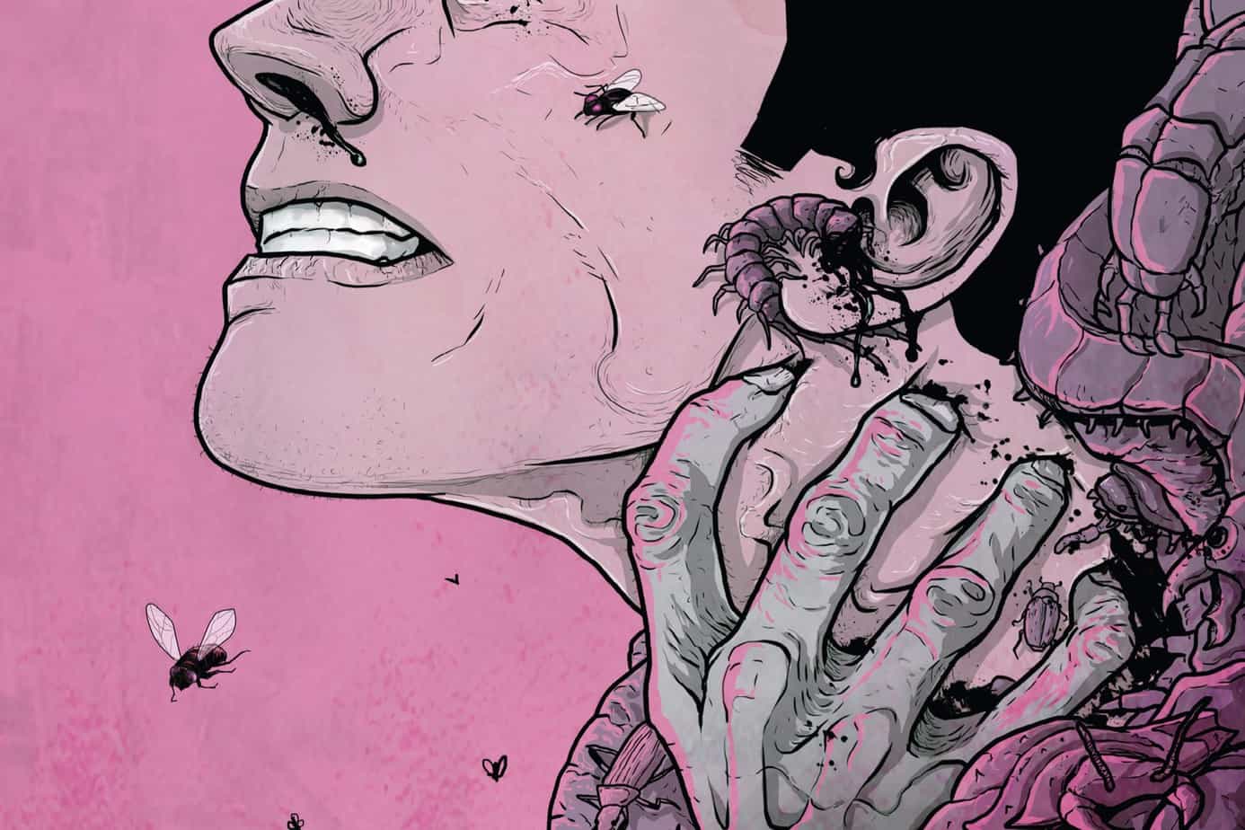
The artwork for the third issue is just as good as the last two and Sudzuka gets a lot of variety packed into the story. The confrontation with Markus has an unsettling purple theme that, again, seems to give it an unnatural connotation. When Trick does a disappearing act, the six panel sequence has a wonderful rhythm that provides a nice break from the exposition. However, there’s a scene later on involving the camera crew that clearly attempts to imitate the found-footage style horror that’s so popular at the momen. Except it just doesn’t work. I’m not really sure it’s the artist’s fault, as the video footage isn’t sold visually at all, but there’s also the clear problem of Sudzuka’s “ghosts” looking pretty pitiful. The more I see them, the more I think they’re actually distractions from what’s really going on. Fortunately, that’s the only real falter here, artistically.
Credit must also be given to Image for continuing to put out a well-illustrated, well-written, full-length comic, reasonably priced, that shows up on shelves on schedule and, most importantly, is uninterrupted by ads. Thank you, Image, for being a bastion of sanity in a industry who still approaches business like their fanbase never grew up.
So, it’s issue three and GHOSTED still has its hooks in me. Something BIG happens this issue and while it doesn’t connect any dots, it provides enough context for the events that occur to keep me from being dissatisfied. It’s hard to do that and GHOSTED has succeeded at it twice. So GHOSTED, ironically, gets to survive the game.
FBP #3
Writer: Simon Oliver
Artist: Robbi Rodriguez
Colorist: Rico Renzi
Publisher: DC/Vertigo
Price: $3
Okay, it’s called FBP now. Not Collider. Whatever. Before we talk about what I REALLY want to talk about, let’s talk about FBP.
The story of this issue is a perfect beat that jumps right into the insanity we left off with in issue two. Bullets fly, but not in the way you’d expect, and someone is left for dead. I love, love, love that Oliver uses the bendy physics of the Bubbleverse as a nice way to drive a thrilling plot from one set piece to another. There’s some nice breaks in the action as the scientists outside the Bubbleverse slowly breakdown just how things could (and inevitably will) go wrong. As the book comes to a close, our protagonist is racing against a clock that just started ticking a lot faster. The pacing is taut, the dialogue is sharp and the reveals are slick. Oliver should be writing TV shows, but fortunately we’ve got him doing comics.
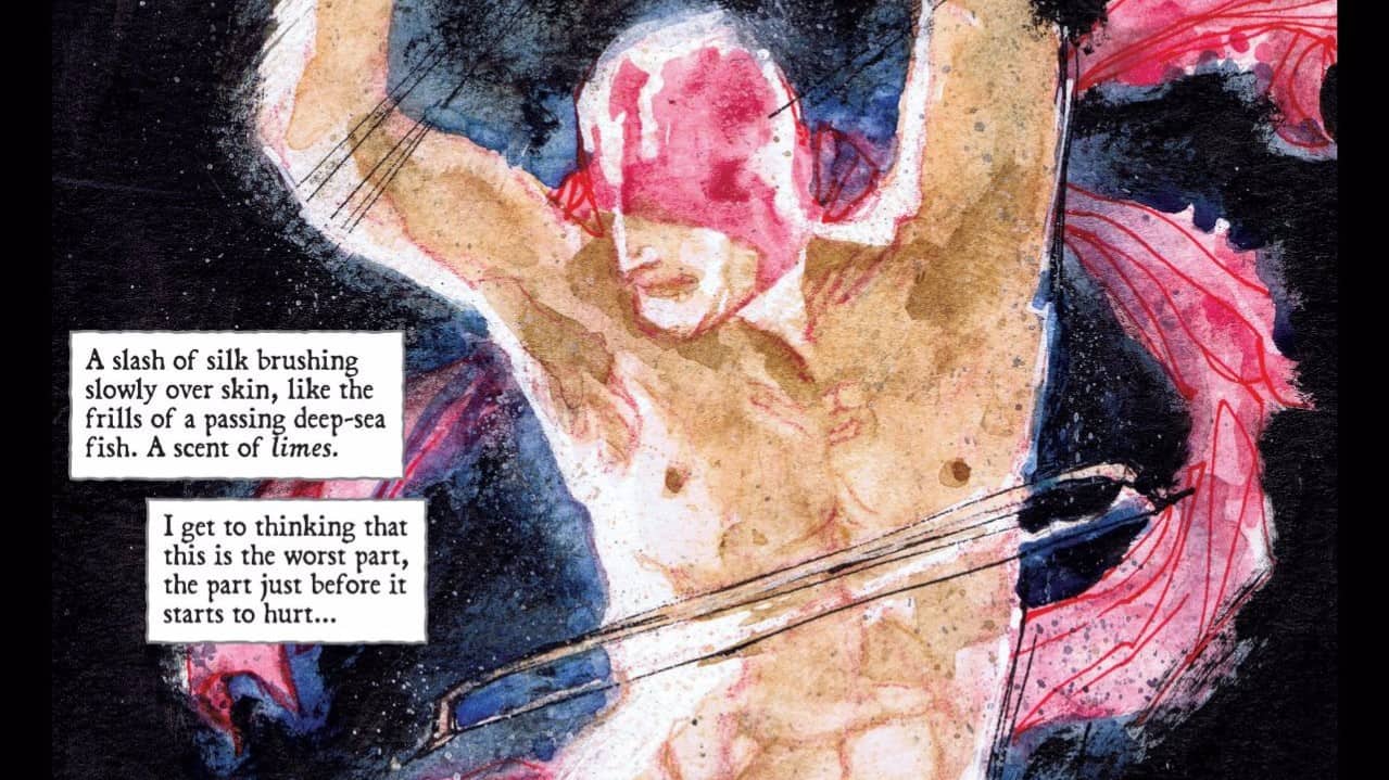
And the art of FBP proves that comics are a better medium, by far, for the story Oliver is telling. Sure, we’ve seen the type of things that happen on pages one through six before, but it’s done with more exploding brilliance than in most movies. But that’s not even the extent of what the art reaches for; at the book’s climax, you see something so incredible impossible, there’s just no way it would’ve worked in anything other than a comic. It’s to the credit of Rodriguez and colorist Renzi that every page is packed with energy and dynamic illustrations, even with the shifts in tone. Conversations happen not just in dialogue but with character expressions rich with detail. It’s top notch artwork that I can’t get enough of, even if it’s not as detailed or as controlled as the type of stuff you see in cape books.
But here’s where things go sour; Vertigo is fucking up the whole game, royally. First, a page count of the full book: 32 pages. Pages of actual comic: 20. That’s a total of 12 pages of ads. That is more ads in one book than ANY book I’ve picked up. Ever. Let me explain how bad this is: in a previous review, I griped about Red Sonja’s ridiculous amount of advertising; 22 pages to a 32 count book. They beat Vertigo by two pages. But here’s the big slap in the face; I also complained about how Dynamite slapped two pages of ads back to back in the middle of their books climax. But they got nothing on Vertigo; there is literally an ad EVERY THREE PAGES. AT LEAST.
But I LOVE FBP. What’s a comic fan to do? Pretty easy answer, actually; wait until the next issue is on shelves. Pick it up. Flip through. And, depending on the amount of advertisement within, drop the series like a demon core. And anything Vertigo related as well, for that matter. Because a column called Comic Execution is not going to put up with that kind of bullshit.
 RED SONJA #3
Writer: Gail Simone
Artist: Walter Geovani
Colors: Adriano Lucas
Publisher: Dynamite Comics
Price: $4
The newest issue of RED SONJA comes in with a weird situation. My biggest gripe about the previous issue is now, strangely, rendered moot by my review above. So, really, in order to survive execution, all RED SONJA #3 has to do is live up to the thrill that was the previous issue.
The story isn’t entirely up to this task. We’re reintroduced to Sonja in a dire situation, per the previous issues events. But it isn’t long before we’re shuttled back in time to when Sonja wasn’t yet Red Sonja. The flashback story gives us a welcome insight into just how she became such a ruthless killer. It’s well told and Simone manages enough powerful storytelling to make such a compact narrative really hit hard, even if it does feel a little rushed. The flashback wraps up and we’re back to the present where a rather obtrusive deus ex machina arrives just in time to save Red Sonja… OR DOES IT?! LOL JK NOT REALLY. Seriously, even the preview summary of the next issue makes it VERY clear that the cliche, transparent cliffhanger ending only has one possible outcome. Surely you’re better than this, Gail. But you’re forgiven, as the rest of the issue is a delightfully strong work.
And the art team executes Simone’s vision perfectly. The wintery surroundings are lush and a delight to absorb, the character interactions are fleshed out in robust detail, panels dance in well timed array, colors are solid but deep, with bursts of exuberance during the potent action. There’s nothing quite as vivid or transcendent as what Rodriguez is doing in FBP but I suppose, if you like that sort of thing, there’s a lot of nicely drawn bodies here. And not just Sonja’s admirable physique; the bandit’s leader in the flashback has a LOT of “exposure” if you will, and Geovani doesn’t spare an ounce of muscle. Good call, that. I’d been a bit worried this series would really fulfill the annoying cliche of a world of warriors where only one person runs around half-clothed and that person is a woman.
And I guess Vertigo gets a free pass for slapping a two page spread of advertisement in the middle of the book. Fortunately, it’s not so poorly placed this time around. Still, it’s a four dollar book. I really feel like something this expensive shouldn’t have an interruption. But if I’m paying $3 for a book CRAMMED with ads, I don’t have the right to complain about this one being somewhat more expensive but mostly ad-free. This is the third round for RED SONJA and I can’t justify axing this book, so despite the somewhat terminal state of affairs within, this comic is our second survivor.


